Search Engine Optimization

A Review of the Top Search Engines in the Philippines
Learn how to harness search engines in the Philippines to reach and engage with your target audience effectively. Read more in this blog!

Top Google Searches: Philippines Insights
At the end of every year, Google releases the top searches in every country, including...

How to Hire SEO Specialists in the Philippines
Search engine optimization (SEO) specialists have become pivotal to succeed in the dynamic world of...
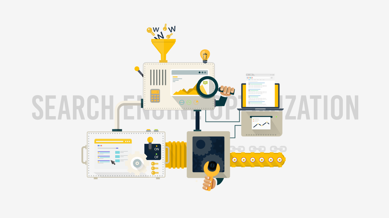
A Complete Guide to Search Engine Optimization (SEO)
Using professional seo services can boost your online marketing strategy quickly and effectively. Learn all about its importance with this comprehensive guide.

Why Search Intent Must Be the Foundation of Your SEO Strategy
Every online query has a purpose, which tells you what kind of information the user needs. Learn how search intent makes your SEO strategy more effective here.

Frustrated about your business
blog’s performance?
Stop going around in circles and start implementing a
Content Marketing Strategy that works.

Content Marketing
See More Content Marketing Blogs
Content Marketing in the Philippines Reaches Tipping Point and What This Means for Local Brands
Want to improve your content marketing performance? Partner with a fullstack digital marketing agency in...

The Beginner’s Guide to Content Marketing
Planning to jumpstart your content marketing for your business but don’t know where to start? Don’t worry! Here’s a comprehensive guide for beginners and experts looking to brush up their content marketing knowledge.

Inbound Marketing vs. Content Marketing [Infographic]
Let’s compare the two marketing strategies. Many people use the terms inbound marketing and content...

How to Stand Out and Succeed at Content Marketing
Content Marketing being a huge deal this year is a given. We all know how important...

Should Your Business Outsource its Content Marketing?
In this post, we’ll explore everything you need to know about hiring a trusted digital marketing company for your content creation.

Paid Advertising
See More Paid Advertising Blogs
The Cost of Social Media Advertising in the Philippines
Is it worth advertising on social media platforms in the Philippines? Find out how much platforms like Facebook, X, and YouTube cost and how to make the most of your ad spend.

How Much Do Facebook Ads Cost in the Philippines?
Navigating Facebook ad costs? We’ve achieved remarkable results in the Philippines through precision targeting, impactful...
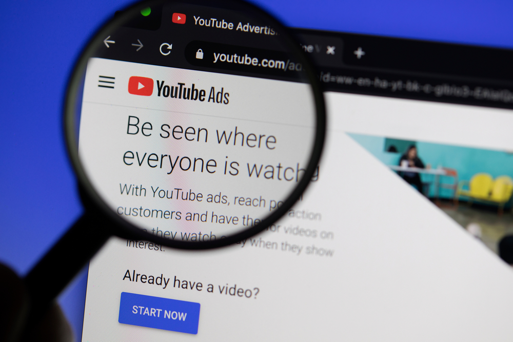
YouTube Ads Cost Philippines: Are They Worth It?
The way people engage with media has shifted over the past few decades as the...

A Complete Guide to SEM (Paid Search)
In today’s digital age, businesses rely on SEM to drive their marketing efforts. However,...