
The dawn of the digital age has given us numerous gadgets that make our lives easier, such as phones, laptops, and computers. With just one tap, we can easily access the information we need. Because of this, people consume content quickly and in great amounts on a daily basis. This further boomed as the pandemic rolled in and people’s time on social media increased tremendously.
Because of this saturation, the online sphere has become a plausible way for marketers and businesses to promote themselves. With that, it’s high time for businesses to push out relevant content online, answering their target audience’s problems and issues in their buyer’s journey.
If you’re looking to use content marketing for your business and stay ahead of the competition, here’s a comprehensive content marketing guide to help you begin your content marketing journey.. From content marketing definition down to how algorithms affect content marketing, we’ve got you covered! How to start content marketing? Here’s a top-to-bottom guide to content marketing for beginners.
What is Content Marketing?
Content marketing is actually a very simple concept.
It’s regularly creating and distributing valuable, educational, and highly-relevant content for your target market. When you add value to their lives with the content that you create to help solve their problems, you build trust and industry authority. So, when they’re ready to make a purchase decision on a related product or service, you’re the brand they think of first.
Content Marketing: By the Numbers
Curious as to how content marketing does the job? Here are some statistics that show you how!
- Over 75% of digital marketers have expressed their preference for an SEO content marketing strategy. (source)
- Marketing agencies have seen an increase of 62% of clients availing content marketing services as 70% of marketers invest in content marketing (source)
- Using effective blog marketing strategies increases your chances of higher search ranking by 434%, which is important since 95% of searchers never go past the first page of search results in Google. (source)
- Majority of respondents, at 44%, usually consume three to five pieces of content before deciding to reach out to the company. (source)
- Short videos are a popular choice for 69% of respondents when learning about a product or service. (source)
- Included in the list of content marketing benefits is that it costs 62% less than outbound marketing and generates over 3x more leads. (source)
- The top three sources for customer retention are email marketing (58%), social media (37%), and content marketing (32%). (source)
- For 61% of customers, brands with a digital marketing content presence are most preferred. (source)
In today’s age of technology, social media and the internet have made information readily available and easily accessible to its users. Because of this, more and more businesses have started to utilize this quick travel of information for their marketing strategies. But, how did content marketing start?
History of Content Marketing
Now that you’re getting started with content marketing and understand its meaning and power, it’s time to explore how it all began
- Early versions of content marketing (pre-1900s)
One earlier example of content marketing that best embodied its core concept was John Deere’s “The Furrow” magazine. By injecting engaging stories when giving valuable pieces of advice for farmers to help their businesses flourish and thrive, he was able to create an audience that may turn into his customers.
- What followed next: The Michelin Guide (1900s)
Michelin, the French tire company, had employed the same tactics except they took things up a notch. At that time, France only had 3,000 vehicles driving along its roads. Being a tire company, this proves to be a challenge as they’ll only have a few customers to cater to. In an effort to increase demand for vehicles, the Michelin brothers created a travel guide for motorists on the road, giving birth to the Michelin guide.
This detailed guide was well-researched, design-oriented, and provided readers with helpful advice and information. Not only did this contain maps and other auto advice, but it also contained the best restaurants that travelers can visit. As a result, this appealed to a broader audience rather than just the current set of vehicle owners at the time.
With that, they pushed the demand for vehicles, ultimately raising the demand for tires as well. The Michelin guide is still alive and used today as most chefs worldwide try to obtain its three-star approval, while travelers use it as a guide to which restaurant is the best one to try.
- Content marketing takes on another form (1900s cont.)
Moving forward, another form of content marketing emerged: the radio. The emergence of this device had evolved content marketing from paper to soundwaves as it became a popular communication channel. One of the prominent content made on radio back in the 1930s was the “soap opera” by Procter and Gamble to promote their new soap, targeting female listeners.
Another notable form of content marketing is the mascots by cereal companies. In the 1960s, cereal companies used colorful images and mascots to attract children to their products while giving parents a better recall of their brand.
The idea of using mascots for branding is still used today. Now, cereals aren’t the only ones using mascots. Other companies use mascots to personify their brand so their audience can relate to them.
- Birth of the online sphere and online content (present-day)
As we enter the digital age, content marketing shifted from papers to screens. The internet made information easier to distribute and circulate fast. Because of that, content online took on many forms, including ebooks, blogs, articles, reports, and videos. The focus has shifted to high-quality and engaging content revolving around the customers, supplemented by an effective distribution system.
As time passed, various blog websites have sprung up, and companies can further their reach through guest posts or by sharing their content on different social media channels. Now, marketers employ a combination of the types of content marketing, from regular blogs to videos, for building a solid customer base and lead generation.
Elements of Content Marketing
Content marketing has gone through its evolution. But in its different forms and versions, there are some elements that remain true and effective from one era to another which make it a digital marketing discipline you can tweak and fit into any mold.
1. Consistently creating valuable and relevant content
Content marketing is a long-term strategy. You don’t create content once—you create it regularly. Regularly publishing relevant content helps you build strong relationships with your audience.
According to Google’s Avinash Kaushik, “Content is anything that adds value to a reader’s life.” Content marketing educates your buyer persona about their problems and lays down solutions to those problems, and not about who you are or what you do/sell.
When it comes to creating valuable and relevant content, it’s always a good idea to see what works and what doesn’t by checking out the competition. Best part is, they learn from their mistakes so you don’t have to.
2. Distributing content
With a whopping 3 million blog posts published every day, you have to make sure you effectively distribute your content to your target audience.
Content syndication is one way to do it, as it allows you to re-publish your content on third-party websites. You’ll want to find popular and high-ranking websites in your niche that think your content deserves a spot on their domain for people to see. Content syndication thus enlarges your audience reach and provides greater exposure for your content.
It’s also important that you make it easy for your audience to share your content. If you’re not adding social sharing buttons in strategic places on your content, you’re not maximizing the use of quick and easy ways that enable your audience to distribute your content on the web.
3. Attracting and retaining a clearly defined audience
To create relevant content, you have to know who you’re creating it for—also known as the buyer or customer persona. You have to know what your target audience’s problems are, how they can find out about you, and what factors they look into when making a purchase decision.
It’s also not just about finding potential customers. Content marketing strategies also help in keeping your existing customers happy with your product or service by continuously providing them with relevant content.
4. Driving profitable action
While content marketing isn’t as “hard sell” as advertising, the main goal is to have a potential customer buy a product or avail of a service.
Original, data-backed, and well-written content can help you get to this goal, so make sure that your team focuses on this. As a content creator, you can meet certain quality standards by constantly updating yourself on how Google’ and other search engines’ ranking algorithms work.
The more useful your content is for online searchers, the better it will rank on the SERPs. Needless to say, this can lead more and more visitors to your site. You can then use it as an opportunity to further nurture and engage your prospects, all the while growing your inbound sales funnel.
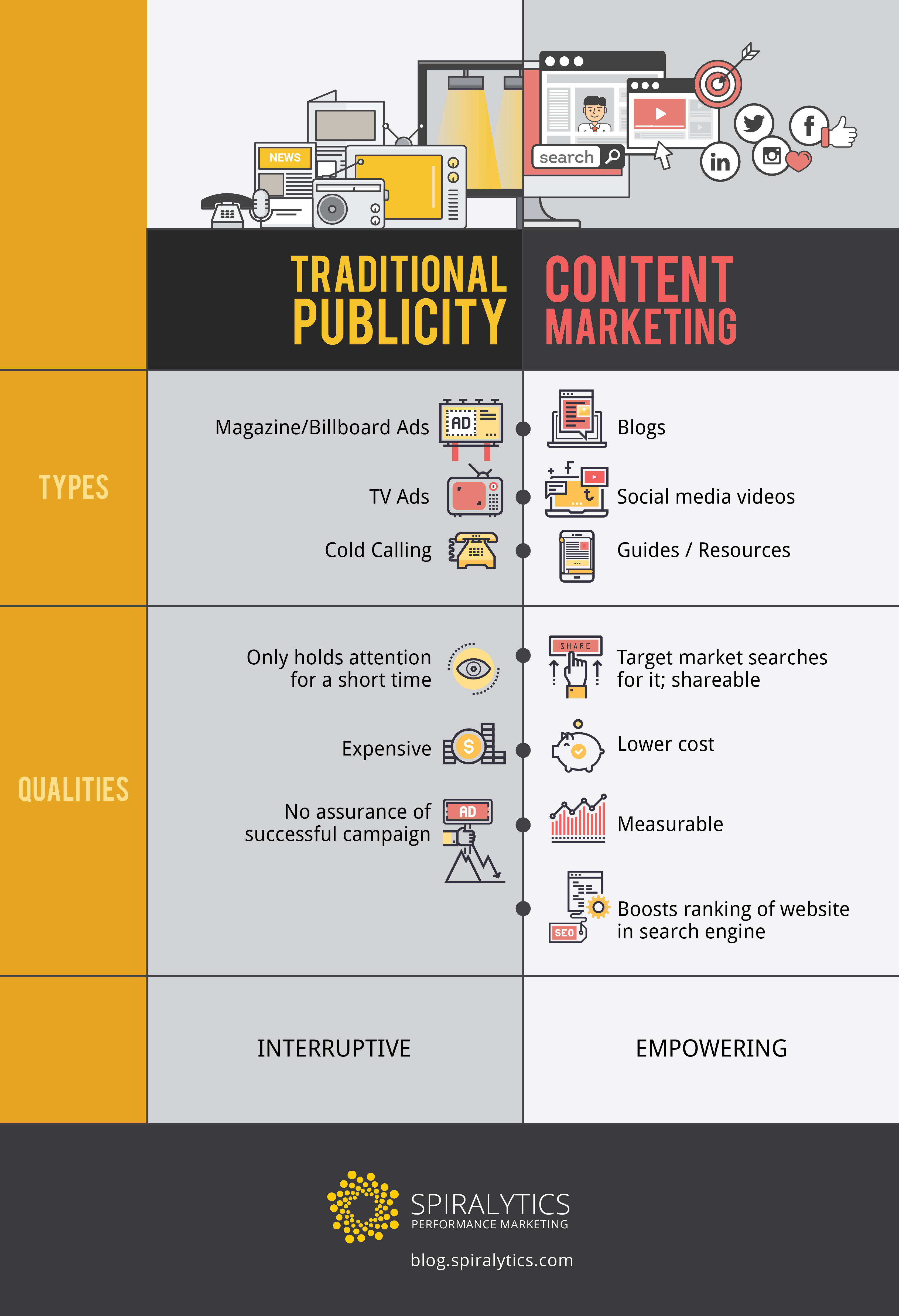
Traditional vs. Content Marketing
Content marketing isn’t interruptive like TV ads or billboards that pop up here and there. On the contrary, content marketing is empowering because people in your target market are actively looking for solutions to their problems with the help of your content.
Take a look at the visual below in which we illustrate the key differences between traditional marketing and content marketing.
Types and Formats of Content Marketing
At this you might ask, “What type of content should I begin with?”, “What type of content will work for my target market?”. Here’s a rundown of effective content marketing types and formats to jumpstart your digital marketing presence:
- Blogs/Articles
Blogs and articles are some of the most popular types of content. They’re usually quick to read and easy to digest to match online consumption habits. Due to this, it is important to capture and sustain that attention. You should divide ideas into bite-size chunks so that they’re skimmable and easy to navigate.
- Infographics/Visualizations
Infographics are liked and shared on social media 3x more than any other type of content. Their highly attractive design catches the reader’s attention right away, and the way they’re presented makes them easy to process and learn from. Moreover, you can incorporate innovative media in an infographic like animated GIFs.
For an infographic to work for you, don’t focus on the design alone. You should also remember that not every story or concept can be explained effectively in an infographic format.
- Ebooks/Whitepapers/Case Studies
These types of content go beyond the usual length and tend to differ in tone and approach. They serve as content offers that your target market can download for purposes like research. Typically, these are presented in PDF format.
Because of the valuable data that they offer, you can use eBooks, whitepapers, and case studies in exchange for the reader’s contact details. Aside from value, other elements like design, layout, and presentation matter heavily in these types of content.
For more on the different types of content, check out this post: Every Blog Content Format You Can Create (With Examples)
Benefits of Content Marketing
Content marketing can help you achieve various business goals and enhance your digital presence. Because of its different formats, content marketing can also give your business different benefits and advantages:
- Build Brand Awareness
Are you new to the industry? Or have you released a new line of products? Content marketing can help your message reach your target market.
By creating, publishing, and distributing content that is in line with your target market’s problems, you can generate topics that provide fresh, relevant solutions. In line with that, you can upsell your products or services through your content while building trust and industry authority for your brand.
- Increase Site Traffic
By providing valuable content to your target market, your business’ blog will build a reputation as a hub for credible and accurate information. Through word of mouth and simply sharing these content pieces on social media, new visitors will be driven to your website.
Additionally, you can also choose to pursue a guest posting strategy. This is the manner of getting your blog posts published on another website with a link back, which in turn increases your own authority. More importantly, you’re gaining exposure to a whole new audience of relevant prospects that you can direct to your website.
Content marketing offers a sturdy foundation for boosting your site authority and keeping it relevant so you can take advantage of organic traffic from SEO.
- Drive Direct Conversions
If your target market is convinced enough that you produce valuable content, they might just convert right there and then. A conversion can be any of the following: a signup, account creation, download, form submission, or sale.
Compelling headlines, succinct copy, the right calls-to-action (CTAs), and captivating images—all of these are essential in generating conversions.
- Establish Thought Leadership and Trust
Content marketing allows you to showcase your business’ strengths and competencies. This helps you establish trust both on an audience level as well as on a search engine level.
Firstly, you’re building your image as an expert and a trustworthy source of information for your target market. When they trust you more, they’ll be more receptive to your marketing campaigns.
Secondly, keeping website visitors on your page for longer with valuable content signals to search engines that searchers are satisfied with the content you provide.
- Improve Search Visibility/SEO
Through content marketing, you can publish blog posts that have the specific keywords you want to rank for. When you’re using the right words to support your keyword strategy, search engines will trust that you’re providing the most relevant content to searchers and will improve your rankings accordingly.
Also, you can build links with the keywords that your content uses to improve your search visibility and SEO rankings.
Related article: How to Boost Search Rankings Through Content Marketing
- Enhance Lead Generation Campaigns
Aside from blog posts, content marketing also allows you to produce different formats and types of content such as eBooks, case studies, whitepapers, and webinars or podcasts.
It’s important for you though to create lead magnets with your content, which means the reader needs to provide contact details such as their email address to access the content itself. Also known as gated content, these materials help you capture leads, so you can initiate a dialogue and drive them down your marketing/sales funnel.
- Community building
As mentioned, content distribution is a crucial part of content marketing. A well-written and well-researched piece of content is no good when you fail to effectively distribute it to your target market.
You should always connect your blog to your business’ social media accounts, as this lets you notify your target market if there’s new content they should pay attention to. It’s also a good idea to have a brand newsletter, so you can maintain a more personal conversation with your audience.
Social media and email marketing offer a way for you to build a community for your blog and, moreover, for your brand and business.
- Increase Client Retention
Aside from gaining new customers, you should always remember that content marketing also helps to improve your client retention rates.
For starters, you can use content to build an onboarding email campaign that educates your customers and teaches them how to maximize the use of your product.
You can also utilize your user data as customer intelligence. For example, if a user clicks on a whole lot of blog posts about “SEO,” you can bet that approaching them with a proposal that’s SEO-focused will have a big impact.
How to Build a Content Marketing Strategy
After knowing what content marketing can bring to your business, it’s now time for you to build your content marketing strategy from scratch.
1. Set goals
Your content strategy will depend on what your content marketing goals are. You’ll have a clear idea of what you need to do when you study your marketing brief thoroughly. Ask yourself these questions:
- What is the product?
- Who is the target market?
- What are the goals?
- Who are the competitors?
A great content marketing strategy has to be backed up with market research, so that your brand can adopt a strategy that makes it stand out amongst your competitors. This data also allows you to accurately identify key content performance indicators and optimize your content strategy around supporting your overall marketing goals.
2. Identify your target buyer persona
Your target market is not a faceless person in the crowd. At the very least, every marketing effort should be aimed at engaging your target buyer. Therefore, you should build a persona for this target buyer.
You can follow these steps as you create the profile of an ideal buyer for your business.
- Identify their demographics, job, pain points, and buying behavior, among others.
- Map out the buyer’s journey—from the awareness to the conversion stage.
- Put yourself in their shoes and create content that offers the right amount and type of information they need to know about your product or service every step of the way.
3. Audit your existing content
To sustain the production of compelling content, you need to look at the current status of your content marketing. In this manner, you can see which of your content performs the best or otherwise. You can also use existing content performance as inspiration for future content.
Content auditing may also mean examining your blog in various aspects: design, layout, format, nature of content, authors, and target of content. Use your metrics, such as bounce rates and time on page to help you analyze your existing content. From these insights, you can develop sound recommendations and implement the necessary changes moving forward.
4. Research top performing content
Every business has its own set of competitors. You can observe your competitors’ blogs and see what types of content they produce and how they perform. Not only can you learn about new tactics to adopt, but this will also allow you to better distinguish your brand and stand out from the competition.
Aside from doing an analysis of your blog, you should also do the same when it comes to your competitors. You can do a competitor analysis on the keywords you’re trying to rank for. Then look for the top global content for those keywords and analyze the factors that make it perform well.
5. Generate topics
Based on your keyword, competitor, and audience research done in the first four steps, you can develop topics that are relevant, accurate, and compelling. Just make sure to include your target keyword in the title to make the most of its SEO value.
6. Create a distribution plan
After generating your topics, you should think about where you want to share these content assets. You can utilize social media platforms like Facebook, LinkedIn, Pinterest, Twitter, and Instagram. You should also make use of email newsletters to distribute your content. These are the people who are already listening, so make sure you’ve got something to say to them.
Additionally, think about implementing more advanced distribution strategies like content partnerships and content syndication to give your content a much-needed boost.
7. Implement
Now that your plan is all set up, it’s time to execute! You can hire strategists and writers to produce your content or utilize your current staff. Needless to say, your content creators should be good writers and great researchers too.
You’ll also need designers to help you produce visual content. Help them out with design pegs and inspiration that they can use. Always remember that good content is the combination of well-written and well-researched information, as well as the visual media that accompanies it.
8. Measure, adjust strategy, and repeat
What a lot of people forget after implementing content marketing is tracking the performance of their content. You can formulate your own frequency and data points for performance reports—whether weekly or monthly to organic traffic through SEO or paid ads through PPC and more — all depending on the goals you’ve established early on.
The key metrics to track and measure should include conversion, brand interest, blog traffic, social media shares, and built links. They will tell you if you’re doing the right thing, if you’re not, or if you need to adjust specific elements in your strategy. Continuous optimizations and improvements will eventually lead you to a powerful, customized content strategy that works specifically for your brand.
Content Marketing and Buyers’ Journey
Ultimately, your content marketing strategy should be aligned to the buyer’s journey. As you create different forms of content, and articles on various topics, this should lead them along the sales funnel eventually ending with a decision or conversion.
1. Awareness
Just like what the name suggests, prospects at this stage of their buyers’ journey are only becoming aware that they have a problem that needs to be solved. It is the information-gathering stage, where they have little knowledge of addressing their concerns. Because of this, they’re deemed as a low-value lead since they are in no shape to make a purchase decision.
Here, you’ll have to nurture them towards the consideration stage by developing more trust in you through upfront value content with as little commitment or purchase pressure as possible. High-converting blog pages, infographics, and ebooks that understand their pain points and direct them to a solution are a surefire way to drive them down the sales funnel.
2. Consideration
In this second stage of the customer journey, they have given a name to their problem but have yet to determine the best solutions. Your prospects are defining their options and checking which solutions are the most suitable. Much like the first stage, they are still incapable of making purchase decisions. However, they are one step closer and laying out all the available options on the table.
Providing the right content here helps nurture leads by deepening customer relationships and further establishing trust. The best content formats you may want to consider for this stage are comparison guides, case studies, and free samples, as they help your customers to consider you in their options.
3. Decision
The last stage of their journey is where you’ll want to pull out all the stops. Here, you have high-value leads that have determined both their pain points and possible answers to their problems, making them ready to make a purchase decision.
Now that they know how your solution works, it’s time to explain how they’ll benefit from your product or service. One-on-one consultations with your lead could be useful in explaining what life would look like if they were to go with your company. To supplement this, you can use live demos and free trials so that they’ll have first-hand experience of it and push them towards choosing your company.
Promoting and Distributing Your Content
Your work doesn’t stop at publishing. To get your content in front of the right eyes, you need to promote and distribute it to the right people, using the right channels, at the right time. Here’s how:
- Social media promotions
Social media promotion is the first step you should take in promoting and distributing your content. Facebook, Twitter, and online fora are powerful tools in making your content visible to your target market. There are a lot of online communities aligned to your industry so you should maximize them.
- Search Engine Optimization
Making your content appear in the search engine results page (SERP) is one sure way for your target market to find you. By optimizing your content with keywords with high search volume, you increase the probability of your content ranking high in SERP and be the first content your target market reads.
- Influencer marketing
Tap influential and key personalities in your industry if it’s aligned with your marketing objectives and goals. Keep in mind that influencer marketing humanizes your product or service and provides a deeper insight to what you can offer. Influencer marketing also allows you to reach a wide market in a quicker time.
- Content republishing
This promotion and distribution strategy allows your content to have a boosted presence because of the republisher’s existing traction and followers. In line with this, having your content republished on authoritative sites will help in establishing your business as a thought leader in the industry.
- Link building
Building links is a part of your overall SEO strategy. This will help in increasing your Domain Authority (DA) rating and SEO ranking. The more sites linking back to your content, the more Google sees your content as relevant and valuable.
Measuring Content Performance
Another content marketing tip: set KPIs and goals so you can easily check the effectiveness of your content marketing strategy. If you’re unsure what metrics to use and how to measure them, here are a few things to get you started:
6 Key Metrics to Measure
1. Traffic or Pageviews
Content is an essential line of connection with your target audience, and traffic is its lifeline. This tells you whether your content is being viewed or not. Even if you publish a well-written blog or engaging video, all comes to moot if no one is there to consume it.
You may want to check your unique pageviews as it indicates how many times your page is viewed by each individual, giving you a more accurate picture of your traffic.
2. Social Media Engagement
Those share and like buttons on your social media aren’t just for show. They are essential for your posts and content because the more likes and shares you have, the more visible you are and the broader your reach will be. Alongside the comment section, you can discover what types of content your audience appreciates, giving you an easier time coming up with future content ideas.
3. Backlinks
Whether internal backlinks on your other blogs or external ones from others’ blogs, backlinks can do you heaps as it generates authority and traffic for your content. Strong backlinks from qualified pages can improve your content ranking and establish your content as credible. More than that, monitoring this measurement helps you identify which content is worth citing and viewing.
4. CTR
Also known as the click-through rate, this measurement can indicate that your content generates interest when it shows up on the search engine results page (SERP). Several factors can affect your CTR, which you may need to pay attention to.
For example, having a catchy and interesting title will likely gain more clicks from the target audience. Aside from that, meta descriptions and excerpts that contain relevant information may have a higher engagement.
5. Average Time on Page
Monitoring the CTR isn’t enough. You’ll also need to check how long your readers stay and actually read through your content. Simply getting page views isn’t enough because readers just skimming through the blog piece means that it’s not really generating interest and is unable to retain users on your site.
6. Bounce Rate
This measures the percentage of users who immediately leave the website after landing on one page. It means users do not take time to go through other website pages and leave after just one blog post. Factors such as slow loading time or non-attractive blog posts may affect this rate, so you’ll have to pay close attention to this and keep it on a low.
How to Measure Your Content Marketing Performance
With a lot of metrics to track and monitor, it’s important that you identify which ones matter to your digital marketing goals and objectives:
1. Track conversions
You publish content and employ different marketing strategies to generate leads and convert them into customers. With that in mind, you have to monitor your conversions to check if your content marketing tactics are actually effective and working. There are many ways you can track conversions. However, it’s best to use ones where you can get an accurate picture, such as through email subscriptions, or set up a conversion goal in your analytics tool.
2. Identify the metrics that actually matter to you
Now that you’ve tracked your conversions, try to connect which metrics apply to them. For example, followers from your Facebook business page may be interacting with your posts by liking, sharing, or commenting. In this case, an applicable metric for you is the social media engagement metric.
3. Automate
To give you an easier time, automate what you can. By automating your processes, you won’t have to waste time collating and fixing your KPIs manually. Doing so can help you obtain a regularly updated KPI with real-time data for quick analysis and accurate insights.
4. Invest time into tracking and analytics
Once you’ve fixed the data, it’s important to set aside time for analyzing the outcomes to see the effectiveness of your content marketing strategy. Here, not only will you be looking at the metrics, but you’ll also be looking at the ROI of your content marketing campaigns. In this way, you can determine if you have achieved your goals or not.
Content Marketing Tools
To launch an effective content marketing strategy from start to end, these tools will help you in content creation and measure your content marketing performance:
1. SEO Tools for Keyword Research
Finding the right keywords for your business blog to rank for is not a walk in the park nor is it a guessing game. To be strategic and effective, use SEO tools to generate accurate data for your performance reports.
If you really want to rank and be in the best position in the search results, here are some of the SEO tools you can use for keyword research:
- Moz Pro – Its Keyword Explorer is one of the most accurate when it comes to giving you the monthly search volume for keywords.
- Ahrefs -You can leverage this tool to know the keywords that your competitors are using and how much traffic comes from them. You can also view the keyword difficulty to assess if there’s ranking competition for your content.
- WooRank– This lets you track your ranking for keywords you’re targeting as well as analyze your competitors’ keywords.
- SEMrush – Its free Keyword Magic Tool allows you to make 10 keyword research queries per day. The paid version offers data-driven insights about top keywords.
- Google Keyword Planner – This comes as a free tool with Google Ads, providing you with data about keywords straight from Google searches.
- Google Search Console – This is another free tool from Google that tells you SEO-related information like the keywords that your site is ranking for and where your site ranks for those keywords.
2. Content Research Tools
Content research tools like Buzzsumo and Ahrefs help you come up with fresh topic ideas by showing metrics for social shares, pageviews, and built links. With these, you can conduct insightful market analyses that steer your future efforts in the right direction.
You can also use these tools to track key performance metrics and assist you in tracking the performance of each individual content campaign.
3. Editorial Calendar
An editorial calendar can help you plan and organize the type of content you’re going to create whether it’s an article, infographic, or eBook. By having an editorial calendar, you can see which concepts or topics you have covered or have yet to cover and identify potential content gaps.
As an added bonus, an editorial calendar will also help you manage the assignments for your writing team. You can keep track of which posts need to be edited, published, or promoted, so everyone’s always on the same page.
4. Writing
As for writing tools, you can use Grammarly to spot grammatical errors, arrange words better, and simplify the terms found in your content. The goal is to get rid of bad grammar and poorly constructed sentences to give people a pleasant reading experience. You can also use AI paraphraser to refine your marketing content’s word choice and tone into different writing styles.
Here are a few other free writing tools we recommend for every content writer.
5. Distribution
As mentioned earlier, social media platforms are the friends of content promotions, providing a relevant channel to reach the masses. You can use things like social publishing tools and social analytics software to streamline your processes and make them more efficient.
For email outreach, email sourcing and mass email sending, you’ll need some help from tools such as HubSpot, Hunter, VoilaNorbert, MailChimp, and Infusionsoft, among others. These tools are great for automating your email campaigns and customizing your message.
6. Analytics
Tools like Google Analytics help you see, track, and measure the performance of your content marketing strategy. Use these to your advantage by looking at key metrics such as pageviews, visits, clicks, bounce rate, user engagement, and so on.
Analytics tools are essential because they provide you with in-depth information that assists you in formulating recommendations on how to tweak your marketing strategies.
Content Marketing and Algorithms
You often hear the word algorithm when it comes to social media, promoting content, and the like. It’s like this looming object over a content creator’s mind whenever they’re conceptualizing something to publish online. But, what is this algorithm they speak of?
Basically, the social media algorithm is a technological innovation that considers our past activities on a social media platform and tries to “predict” what you want to see next. It sorts posts in your timelines or feeds depending on their relevance to our digital behavior and tendencies. With that, you can more easily access posts and content that you actually want to see and interact with.
Over the years, technological innovations have paved the way for algorithms to work out the kinks in their operation. Because of this, marketers constantly have to adapt to their rules to get to their target audience in the most efficient way possible.
In addition, improvements in the algorithm can give users a better user experience than before. But more than that, content marketers have a duty to strike a balance to optimize for the algorithm while keeping customers at the center of their content.
The Time for Content Marketing is Now
Content marketing sure does have a lot to offer businesses. As the world continues to go online and people consume a great deal of content daily, organizations around the globe have started to use content marketing strategies to broaden their reach and help their customers in their buyer’s journey. Knowing the basics of content marketing won’t hurt—it may even bring in more leads and conversions to help your business grow. If you’re still in need of help, consult with our experts in Spiralytics today and check out how our content marketing services can help you create a data-driven content marketing strategy that truly resonates with your target audience.
Want to know how we’d approach content marketing for your brand? Get a FREE Content Audit today!