Getting started with web design can be such an intimidating task – especially when you’re brand new to it. But no matter how little practical experience you have, you can always learn.
Whether you’re looking to design your own website or have hired a professional but want to make sure you’re making the right decisions for your business, it’s not a bad idea to become acquainted with the basic tenets of good web design. And this guide is the perfect starting point!
Covering the essential elements of good web design in 2020, we’ll teach you how to pay attention to the right aspects of your online presence. Furthermore, you’ll learn how to go further than just aesthetics and create a website that prioritizes user experience, functionality, and SEO. This way, you’ll be pleased with the final product you get.
What makes a good website?
There are numerous opinions about what makes one website better than another. However, when gathering this type of information, it’s best to get it from the horse’s mouth.
When designing a website, you don’t just want it to exist. You also want it to rank high on search engine results pages (SERPs), so you get the highest amount of organic traffic possible. And the main factor contributing to how well you do in this regard is going to be user experience (UX).
According to Google, the core foundations of good user experience include:
- Speed
- Reliability
- Integration
- Engagement
When it comes to speed as one of the main determining factors of UX, we shouldn’t be surprised. We do live in the 21st century, with easy access to fast internet connections and mobile devices. Naturally, we’ve come to expect that a well-made website will load quickly and respond without any lag.
Returning to the question of SERP rankings, it turns out that speed makes for one of the main prerequisites of a prime position. Both Google and Facebook prioritize sites and pages with high loading speeds. And not just that. Research from e-commerce giants like Amazon has also shown that users expect instant gratification when making an online query. When things don’t go their way – bounce rates, well, bounce.
In terms of reliability and integration, these two criteria mainly pertain to the idea that a website needs to load equally well from any device and any location. And this includes those with poor internet connections. Users shouldn’t have to fear that they won’t have access to a website, for whatever reason. A reliable, well-integrated design will provide the same results at all times.
Finally, for a website to be engaging, it needs to be aesthetically appealing, and it needs to offer all the functionalities the users are after. When designing for the web, this is crucial to keep in mind. Designers aren’t just aiming to make something with an artistic appeal (though websites definitely can be works of art). They should also make room for a seamless browsing experience that’s entirely intuitive and well-combined with the design elements.
The case for starting with UX

As you can see from the tips above, usability is one of the main things to keep in mind when designing a website. But the thing is, this isn’t just random advice.
Research has shown time and again that the way users interact with a site greatly depends on UX features. A subpar experience won’t just negatively influence conversions, as it could even contribute to you losing clients. According to WP Engine, websites with loading speeds of 1-2 seconds see nearly three times higher conversion rates than websites that load in 5-10 seconds.
What is more, we now know that people have clear expectations of what great web design should provide.
Due to common web design trends, we can predict how familiar particular website actions are, or how much of a learning curve new interactions require. Keeping these in mind, web designers can stay a step ahead and offer an exceptional user experience, all the while choosing unique aesthetic elements that will support the company’s branding efforts.
In general, there are a few user expectations to keep in mind regarding website UX:
- Visitors expect a website to load in under two seconds.
- It takes them approximately 2.6 seconds to land on the most attractive element on a homepage.
- Once their eyes land on that section, it takes less than a second to form a first impression (mostly based on design).
- People speaking languages from the Indo-European families tend to view websites either in the Z-pattern or F-pattern.
- They’ll most likely only skim the text.
- Users judge a company’s credibility based on design.
- They’ll go to a competitor’s website if they don’t like what they see.
There you have it: all the proof you need to consider starting your next web design project with a UX-first approach. Of course, this doesn’t mean focusing solely on technical details. Rather, aim to create a beautiful visual experience that’s backed up with a seamless usability flow.
Still not sure how to do that? Here are the six most important design elements to pay attention to.
1. Layout
The first part of web design you’ll need to decide on is going to be the layout. And the best way to decide on it is to go by the way people look at websites.
On your homepage, try to cater to the Z pattern like you can see in this example from Eachnight. Place important information in visibility hotspots and try to direct users’ attention towards your most important content.

If you follow standard practice, which is always a good idea when getting started with web design, place your company’s (clickable) logo in the top left corner. It’s the first place people will look, and this way, you’ll be immediately positioning your brand.
Navigation menus, search bars, CTAs, and login forms should also be in the header, but you can choose the variation that looks best with your overall design. Considering that not all websites necessarily have all these elements, you’ll need to consider your customers’ journey and decide what features to offer. Remember: more is not better, so try to keep things as minimalistic as possible.
The hero section is going to be the most prominent part of your homepage, and this is where you should place your company mission and CTA. Ideally, you should stick to a single call to action to avoid confusing or overwhelming your customers.
Finally, the footer of your homepage should contain links for quick access to your website’s most informative pages such as FAQ, Terms of Service, etc. Don’t forget to add contact info and social follow links as well.
As for product pages, the F-pattern will work better, as you can see in this standard example by Nordstrom Rack.
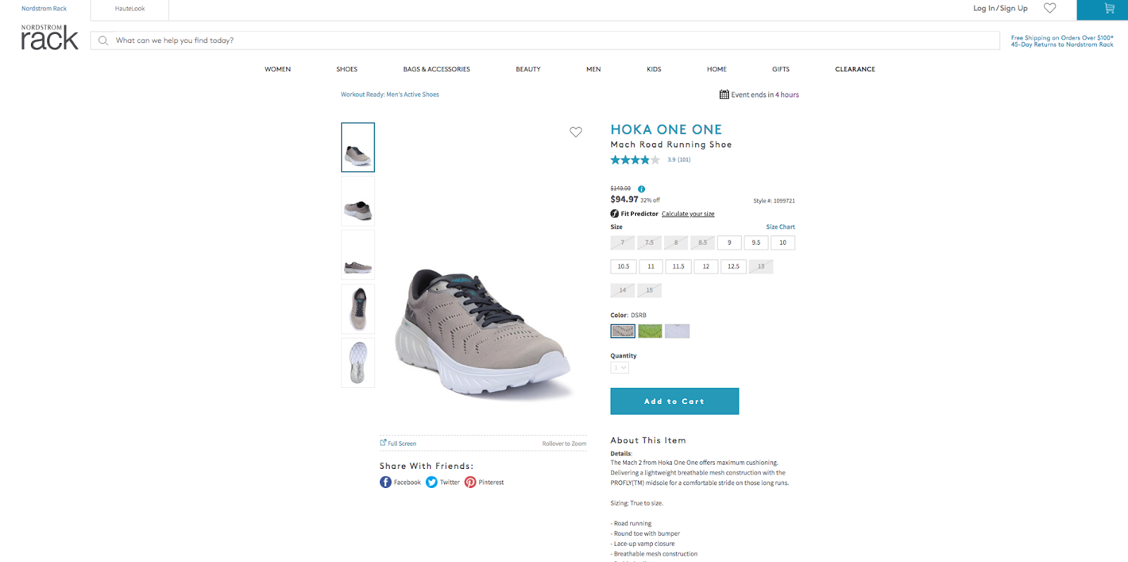
The header info is likely to be the same as on your homepage, but when showing off your products, you want to capture visitors’ attention with a high-quality image in the upper left corner. To the right of this section, add the product description written in simple, clear language, ideally separated into short bullets.
Pro Tip: Before you decide on a layout for your website, make sure you have all the content you’ll be including on it (even if it’s just a first draft). This way, you’ll be able to make the right choices from the get-go and avoid wasting time down the line.
2. Navigation & Structure
Once you have a solid idea of the type of layout you’re going to use, it’s time to think about structure and navigation.
Simply put, web structure is the way your website content is organized. Because your site is bound to grow as your business does, you need a well-organized structure that’ll prevent confusion among users, and that’ll encourage proper indexing by search engines.
Furthermore, with bigger websites, a clear structure can contribute to users finding their way around a site more easily. The brand Jack Wolfskin does this particularly well, as the site structure is visible right below the navigation menu. At any time during their shopping journey, users can go one or more steps back, without having to enter the store and restart their browsing from scratch.

As for navigation menus, there are several choices you can make. Definitely, the most popular one is the classic menu, featured on 88% of all websites. But just because something is popular doesn’t mean it’s the right choice for you. Websites built for mobile-first will more likely utilize a hamburger menu because it’s easier to display on small screens and take up less space when unneeded.
3. Color Scheme
Plenty of web design resources will tell you to choose a color scheme based on color psychology. You can take that route, but it may not always be the best idea.
Instead of visually limiting your design to particular colors based on their meanings, look for ways to create an aesthetically stunning effect that is easy on the eyes, yet still makes a bold enough statement for your web visitors to remember you.
Of course, remember to make color decisions based on your target audience and don’t forget to keep an eye out for what your competition is doing. If you’re trying to start the next big fast-food franchise, you probably shouldn’t go with red and yellow and a logo that represents the letter M.
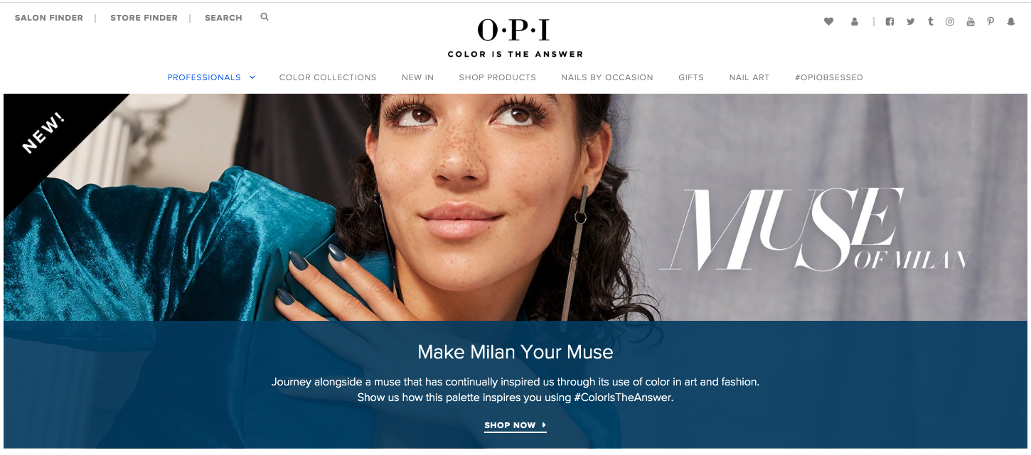
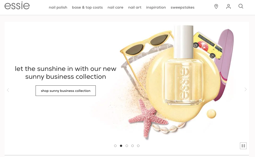
For a good way to see how brands in the same industry can stand apart, take a look at Opi’s and Essie’s websites. While similar in terms of basic functionalities, the two brands take distinct stands on color, with Opi going for a more neutral look, and Essie playing with many different color combinations.
4. Typography
Typography is, unfortunately, a commonly overlooked aspect of web design. However, if you take into account that it’s the visual representation of verbal language, it quickly becomes clear why the font you use can make or break a brand.
Still, more than just helping you position your business as a reliable, professional entity, typography can also be used to evoke feelings or draw attention to certain areas of your homepage. For example, if you have an offer you really want web visitors to see, you’ll present it over an area with plenty of white space, and high contrast, such as in this example from Adidas. If you take a look at just how much the typography stands out on the page, it comes as no surprise that the brand’s Yeezy releases tend to sell out in record time.

Of course, if you’re looking for ways to stand out, you can also kick things up a notch.
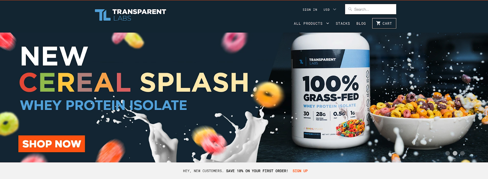
Transparent Labs chose to do something a bit more colorful with their latest product release. Seeing that they’re marketing a brand new cereal-flavored whey protein they made a design choice that is on-point both in terms of branding, as well as emotional marketing. With the color choices, it recalls childhood memories of many people’s go-to breakfast choice – the perfect way to present a protein powder to those who are after more than just the health benefits.
5. Media, Content & Copy
We’ve already mentioned how people tend to lean towards skimming rather than carefully reading website content. With this in mind, you can make the design choices that will allow you to get your message across in the best possible way.
On the whole, when writing text, try to keep it brief and simple. If you’re not sure whether the wording is quite right, check its readability score. Try to keep your paragraphs on the shorter side and use bullet points where possible.
But brief, digestible language won’t be enough in 2020. You also need to add different types of media to your website.
Images and graphics are both standard choices, and they work perfectly for most uses. As it only takes a fraction of a second for a person to fully process an image, this type of visual information can help you bypass today’s short attention spans and ensure you get to communicate your message.
Of course, you can also take things a step further. Add video to your website – and not just on the homepage, but product and how-to pages as well. It’s the medium that drives the highest level of engagement, and it’s only going to grow in the coming years. In fact, 99% of marketers plan to continue using it in 2020 and onwards.
So, if you have the means, add video to your homepage, product pages, and even your website’s resources section, like this example by Ugg.

6. Safety & Security
Finally, don’t forget that great web design doesn’t just drive conversions. It also establishes trust. So, make sure to leave room for elements that will help you brand your company as a reliable entity.
The best way to do so is to use social proof elements on your homepage.
Do this in the form of user-generated reviews, or take things a step further and show off your partners or online publication mentions, which is exactly what SaaS company Teem did. With a client list that includes Airbnb, Uber, Starbucks, and HP, it comes as no surprise that its products are some of the most popular in the workplace and data management category.

Of course, this is not the only way to drive brand trust. In addition to convincing web visitors that you’re a trustworthy business, also make sure that you’ve put all the required security measures in place.
Conclusion
In 2020, platforms like WordPress, Squarespace, and Wix allow users to create websites that don’t just look great but offer an amazing user experience as well. Still, if you’re only getting started, it’s best to begin with something simple.
The tips above will help you stay on track when it comes to design, but don’t let them limit you. The most important thing about great design is that it fits the company that’s using it.
Of course, once your website has gone live, don’t forget to regularly measure its performance, because even for the most experienced designers, it’s the only way to keep up with the times.
Need help with web design? Contact Spiralytics, a UX web design agency ready to help you with your website!