
It doesn’t take a genius to know that buttons are better than hyperlinks.
CampaignMonitor found that CTA buttons had an increased click-through rate of 28%, as compared to link-based CTAs. Copyblogger also found that CTAs which looked like buttons lead to a 45% boost in clicks.
This is because buttons are larger than hyperlinks and can include shadows, gradients, colors, and other special effects—so they stand out on a page. While you can add colors to hyperlinks, you can’t make them as noticeable as a button.
When a page has plenty of whitespace and the CTA button is isolated from other elements, it works to draw readers’ attention. A hyperlink can’t achieve the same effect.
Many businesses have landing pages and emails with CTAs. But how can you create an effective CTA that draws clicks and conversions? Here’s what you need to know:
-
Be as Logical as Possible
You might opt to put lots of buttons on your various offerings—but think again.
It’s ideal to have fewer buttons and focus on your main lead magnets. The fewer CTAs you have, the more likely viewers will focus and click on the lead magnet. In fact, Wordstream found that emails with a single call-to-action increased clicks by 371% and sales 1,617%.
Here’s an example from Huemor:

Another tip is to ensure viewers understand exactly what they need to do next and what they will receive by clicking.
Blogging.org has a CTA popup that shows what viewers will learn when they sign up for the blogging course such as free WordPress installation, training videos, and WordPress themes.

-
Dummy-Proof the UX on Your Website
One of the most basic design principles is to leave whitespace and avoid cluttering. A healthy chunk of whitespace directs a visitors’ attention and draws them towards CTAs.
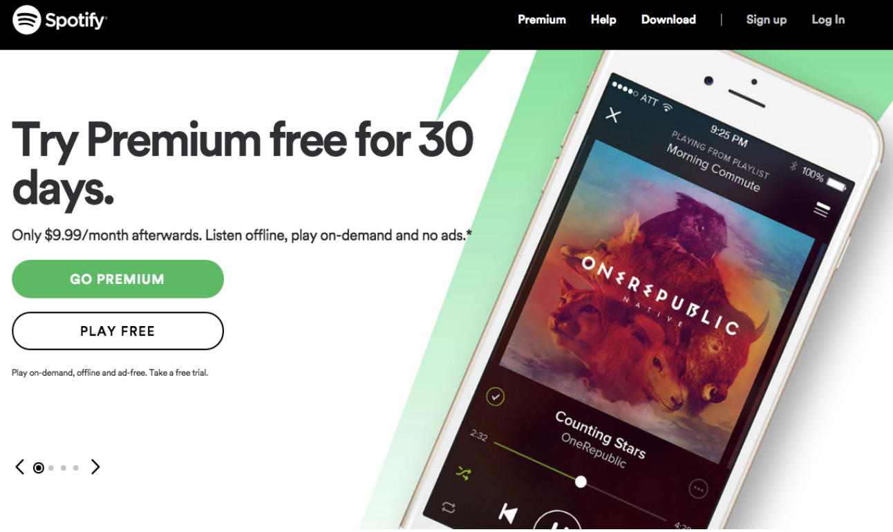
If you want an example, then look no further than Spotify.
The whitespace and main message are large. Viewers know what they’re being asked to do because there are only a few options.
Another tip is to use heatmap tools for measuring visitor activity and understanding click patterns.
A heatmap determines the intensity of activity on a page and translates the data into colors.
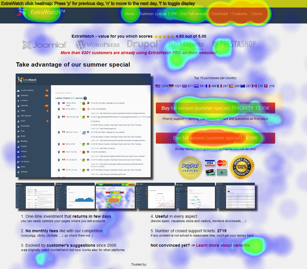
This lets you determine if there’s activity on your CTA or if you should place it in a different location. It also lets you know the elements that visitors misunderstand as links, but are actually not connected to any URLs.
-
Use First-Person Action Verbs and Power Words
They say words have power and the same is true when writing CTAs.
You need to choose words that evoke a sense of urgency and momentum to your offerings. Some call-to-action words or phrases that maximize conversions include:
- Get
- Visit
- Now
- Learn
- Last
- Today
- Buy
- Shop
- Try
Jeff Bullas has a list of effective call-to-action phrases:
- Add to Cart
- Buy Today
- Call Now
- Click Here
- Contact Now
- Donate Today
- Enroll Now
- Find Out More
- Get a Free Quote Today
- Immediate Download
- Join Now
- Learn More
- Register Now
- Reserve Now
- See it in Action
- Sign-up Here
- Start Now
- Take the Tour
- Talk to an Expert
- Watch Our Tutorial
You can also leverage exclusive offers and time-restricted commands. This triggers FOMO (fear of missing out) and encourages people to act because they don’t want to miss out on something that could be great.
A study found that FOMO is most common among millennials. Eventbrite found that 69% of millennials experience the phenomenon and a similar study discovered that 60% of millennials make impulsive purchases because of it.
Some examples of CTAs that could trigger FOMO are:
- Get Your Free Free 30-Day Trial Now!
- Download Now!
- Sign Up Now To Get 90% Off Today!
Wishpond creates a sense of urgency by adding a countdown timer to their webinar sign-ups. They also include a checklist of what readers could learn by signing up:
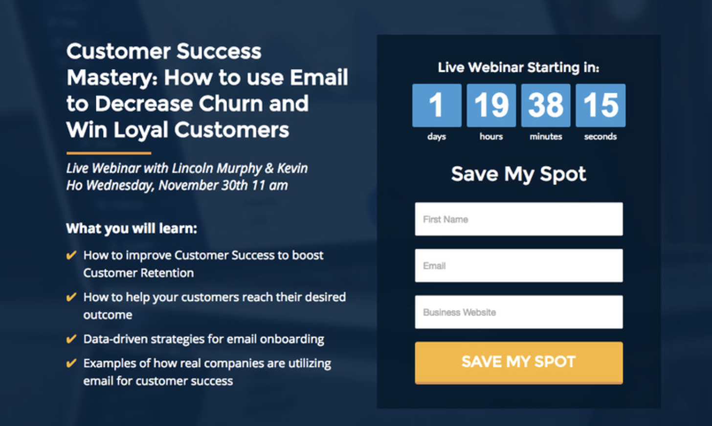
In Wishpond’s popup, they consistently remind customers that the webinar is free through the CTA “Save My Free Spot”.

-
Experiment with CTA Button Shapes and Color Combos
At the end of the day, the only way to determine the best CTA for your pages and emails is to conduct A/B tests and CRO experiments.
There are several tools that you can use for testing such as Optimizely, VWO and Adobe Target. You can opt for any tool as long as it allows you to test your copy, text, design elements, button shapes, and color combos.
You’ll find that small and simple changes can have drastic effects on your click-through and conversion rates.
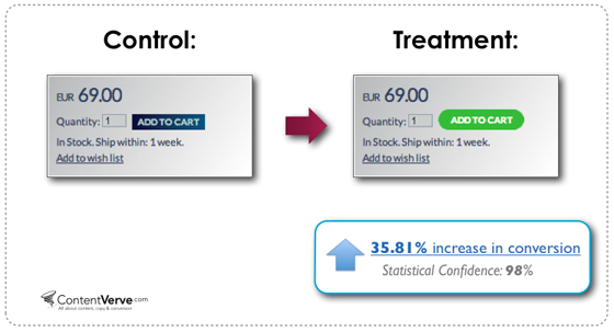
For example, ContentVerve’s test found that a rounded green button did better than a blue rectangle. So you might want to determine the impact of changing the shape of your buttons.
Conversion rates also change based on color contrasts.
You can choose colors by exploring studies on color psychology. QuickSprout found that having a red CTA button increased conversion rates by 21%.
But you can opt for any combination as long as it’s attention-grabbing and does not conflict with your brand’s or background’s main colors.
You can choose complementary colors or contrasting colors via color wheels.
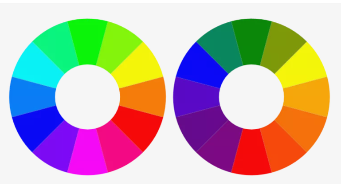
The colors opposite to each other are complementary such as pink and green; and blue and orange. You can visit Color Scheme Designer, Button Optimizer or Canva to find the right colors.
Be more creative with the call-to-action to increase response rates. Try using a QR code (which can be made using any of these best QR code generators) to see if the conversions improve.
-
Use Time Delays for CTA Popups
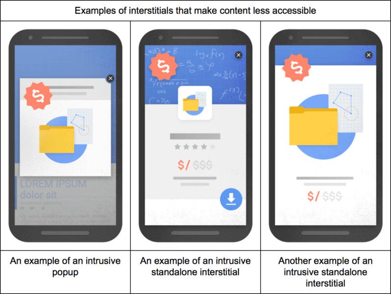
You might’ve read some bad stuff about integrating popups, and you’re not necessarily wrong. But you probably haven’t heard the whole story.
Google penalizes pop-ups that are considered to be disruptive interstitials. This includes popups that appear after a visitor clicks the Google mobile search result. However, it does not cover pages visited after the initial page and delayed CTA popups.
You should allow users to scroll a few times before serving a pop-up. This gives viewers a considerable amount of time to learn about what your site offers, and whether they’re interested to subscribe or sign-up.
Here’s an example from OfficeVibe:

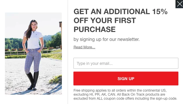
Some ecommerce stores use an exit-intent popup that includes discounts and coupons to encourage visitors to give their email. Because it’s the last chance to get an email, it usually includes a tempting offer.
For example, Horze offers a 15% discount appears as the visitor leaves the site.
You also need to be cognizant of mobile and desktop CTA sizes. If the popup covers the entire page on mobile and it has a close button that’s not easily noticeable, losing the visitor is inevitable.
-
Let Natural User Behavior Guide Your CTA Placement
We usually read from top to bottom and left to right.
Remembering a user’s natural reading flow can help you determine the ideal places to put your button.
Readers shouldn’t have to scroll back up or track down a CTA they previously saw. For example, you want to include a CTA banner after viewers finished reading the main points so you might place it at the middle or end of a blog post. And you probably shouldn’t place a CTA at the beginning of the page when viewers haven’t read about the product or offer yet.
In fact, Neil Patel found that readers prefer to learn about the offer before clicking a CTA so a button located above the fold decreased conversions by 17%.
For example, HubSpot’s article on “Pinterest Lead Generation 101: Best Practices and Hacks That’ll Make You a Pro” has a CTA for downloading their eBook at the very end of the post.

Many studies speculate that the ideal location to put your CTA is at the right based on the Gutenberg Diagram. This diagram places an imaginary “Z” across the webpage. It concludes that the two spots on the right (at the first point of the “Z” and the very end of it) are where viewers expect to take action.
How Will You Improve Your CTA?
- There are tons of ways to improve your CTA’s conversion rates: Improve the UX on your webpages.
- Use exit-intent popups and a lot of whitespace.
- Let users’ natural reading behavior guide your decision.
Don’t forget to add exit-intent popups with discounts and special offers to get a visitor’s email. Although, make sure that it’s not considered as a disruptive interstitial and is easily removable.
Just think about how your readers will respond to your landing pages and A/B test your buttons’ colors, style and text. You can also take advantage of heatmaps to determine optimal button placements.
Unlock the advantages of conversion rate optimization services. Unleash the untapped potential of your website’s performance and experience extraordinary outcomes.
How will you improve your CTAs and increase conversions? Let us know in the comments below.