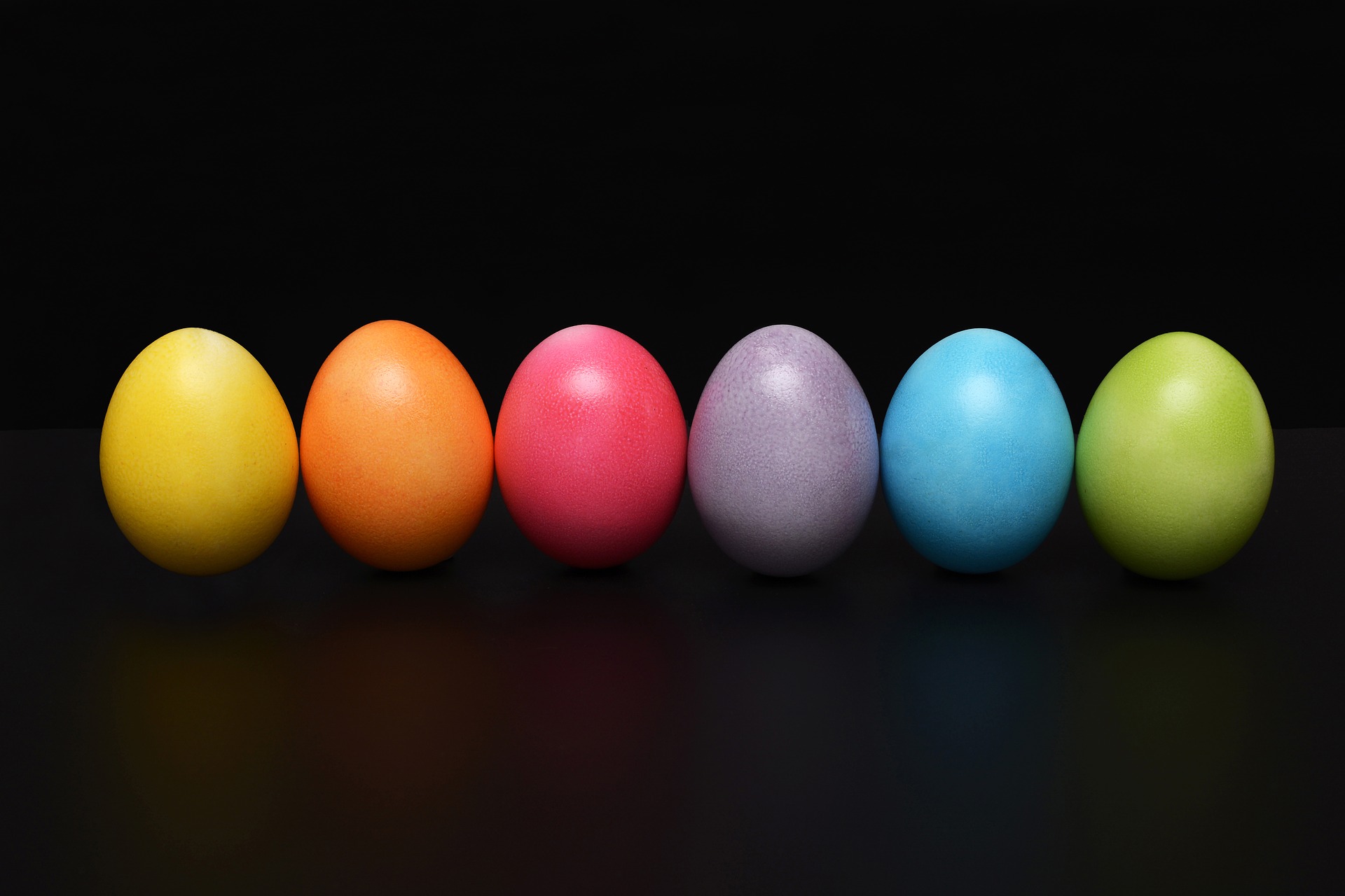
According to some estimates, color is responsible for up to 80% of a brand’s ability to be recognized.
This development is far from how color was associated with branding decades ago. In terms of design and branding, color was long disregarded as mere aesthetics, the primary focus being which colors would make a design look good.
However, as color psychology and marketing research grew in importance, their findings on the effects of color choices on revenue and branding put a new perspective on how designers and business owners viewed color and its role in the process of design and branding.
In this post, we’ll try to illustrate how important color can be and explore its impact on branding, conversions and user engagement. Research compiled by DesignAdvisor shows that one of the most important factors which influence product assessment is color and that color is also a driving force behind a brand’s ability to be recognized. But don’t take our word for it, let’s look at the numbers.
The Stats
Research has shown that product assessment takes about 90 seconds and color accounts for between 62 and 90% of the decision to complete a purchase. Shockingly, color is also responsible for the acceptance or rejection of a product, factoring into 60% of the decision. Furthermore, 2/3 of customers are likely to reject a product if it is not available in their preferred color.
When it comes to web design, color can be a huge driver for conversions and online engagement. Improved call-to-action (CTA) buttons can lead to up to 35% higher conversion rates, with many brands surpassing that benchmark.

The Relation Between Color and Branding
Branding is for any company. Brand recognition can impact your ability to communicate with customers and seriously improve your revenue, as customers are considerably more likely to buy from a brand they recognize.
As mentioned, color is responsible for up to 80% of a brand’s ability to be recognized. Many brands have successfully deployed marketing strategies that established their brand through color. Coca-Cola’s sustained use of red and Facebook’s consistent use of their particular tone of blue are perfect examples, as anyone will recognize or associate the color to the brand and vice versa.
Apart from being a recognizable feature, colors are frequently associated with specific messages. Color psychology helps to understand some of the more common associations. For instance, Coca-Cola’s use of red is successful partly because their chosen color works perfectly with their brand image. Red is an emotional color, conveying a sense of urgency and (some say) enhancing wishes for consumption.
These associations with emotions prove very useful in many different scenarios. For example, brands that want to engage with a youthful and innovative crowd usually go for flashy and cheerful colors, such as pink, orange or yellow.
In a similar sense, as a social media company, Facebook requires trust, making blue a great choice since it symbolizes tranquility, authority, and trust. This is why many trust-demanding industries use blue a lot (healthcare providers being a great example), and why Facebook uses it beyond their logo, and throughout their site and apps.
Clearly, thinking about your brand message before choosing a color is of paramount importance. By choosing a color that truly reflects your brand identity, you engage with your customers through design as well as through your products, which reinforces your chances of being perceived as a professional and trustworthy business.
Attention, Conversions, and Color
Color can be a lucrative tool for driving revenue through conversions and improved CTA buttons. This is mainly due to a key principle: contrast drives attention.
The best colors for CTA buttons are highly contrasting ones such as red, green and orange. These colors are likely to stand out against the rest of your page, as they do not regularly feature in website color schemes. Success lies in how effectively these colors draw user attention to different design elements. For instance, Beamax made their links more eye-popping by changing them from blue to red, which increased clicks by more than 50%.
Another great example is the online gambling site VegasSlotsOnline. They recorded a 175% increase in conversions after changing their CTA buttons from green to a higher contrasting yellow. Other sites experienced huge success as a result of switching to red for their CTA buttons. Dmix, for example, experienced a 34% increase in conversions, and HubSpot found that a red CTA button outperformed a green one by more than 20%.
These examples illustrate that disregarding the importance of color could mean missing out on significant revenue. Taking the time to research color choices thoroughly is definitely a worthwhile component of web design that you should always consider.
Final Note: The Power of Color, and Testing
It’s important to note that color choices cannot be made without thinking of target audiences, and context. This is why testing practices, such as running A/B tests, are of paramount importance. Through testing, you can ensure that the theoretical benefits of selecting a color work in practice.
Color can upend your brand’s visibility, its ability to engage with customers, and even its ability to convert visits into purchases. So, let’s stop underestimating color, and start using it to the fullest!