

Much of today’s market is expanding rapidly onto mobile platforms. It’s no surprise that close attention to mobile traffic is now more important than ever for a successful enterprise. In order to maximize profits and exposure, you must keep an eye on both your desktop and mobile metrics. Optimizing your user experience is crucial, and this process can be very complex since design can be quite different between the two. Any marketing strategy or structure you adopt must be supported by a coherent QA testing procedure.
Despite these differences, the metrics behind the SEO for these platforms is the same. Traffic and retention are dependent upon the experience and functionality of a website. The area we have the most control over is actually the suggestibility. Because of this, a good SEO specialist needs to be aware of the elements that determine these factors for both platforms.
To show the differences between mobile and desktop design for effective SEO strategies, it’s good to draw a few comparisons. First, contrasting SEO metrics for traffic is essential. Comparing CTA placement and analytics will show us the differences between both platforms.
There are many differences between mobile and desktop web design. But, many of the criteria for successful user interaction are actually the same between both platforms.
The most notable factors for SEO between mobile and desktop are:
- retention
- conversion rates
- design satisfaction
Although these factors are very similar between both platforms, they are also very different. With this in mind, let’s take a look at the contrast between SEO metrics for mobile and desktop sites.
Contrasting SEO Metrics for Mobile and Desktop Traffic
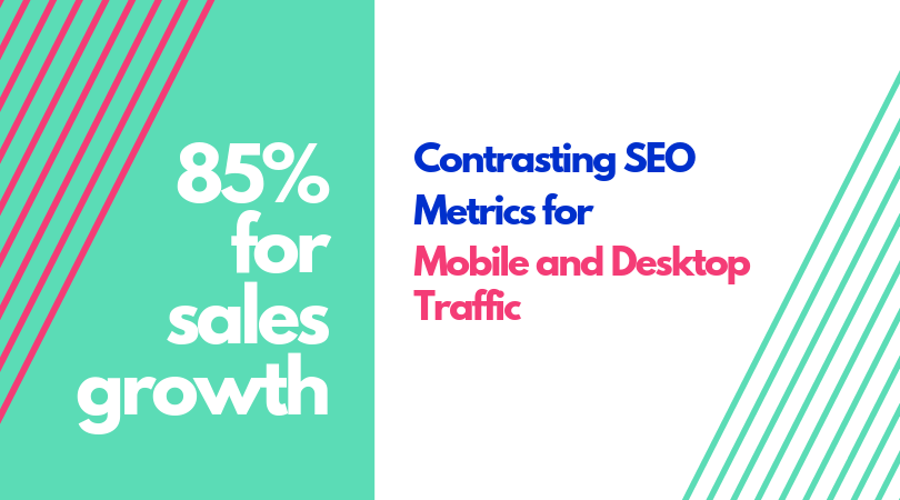
Even though many aspects of SEO are similar, many strategies used in SEO between the two platforms are very different. To understand how these principles can be applied, we must take a look at how the SEO differs between mobile and desktop platforms. The metrics of how your users behave is one of the most essential principles of SEO, and companies that analyze user behavior tend to outperform their peers by 85% for sales growth.
The requirements of desktop SEO revolve around communicating the relevance of a page to a search engine. This is how desktop browser pages appear higher on SERPs. For mobile, user behavior is often much faster, so there are some principles that are different from their desktop counterparts.
The most important thing to keep in mind is that mobile SEO is much more about short head keywords, rather than long-tailed keywords. Since people will avoid long queries, shorter keywords are essential. Another thing to keep in mind is locality since SERPs for mobile searches are very often focused on local results.
One of the most important things for user retention and SERP placement on mobile platforms is mobile responsiveness. If your website does not run well on portable devices, people will become frustrated and look elsewhere. If your site is not mobile-responsive, it will turn people away very quickly.
When you manage to keep these differences in mind as you design your site, you will notice huge differences in your SERP and clicks. Although the actual metrics and principles behind the SEO for both platforms are the same, many things about behavior and SEO strategy are different.
Contrasting Calls To Action Placement for Mobile and Desktop Users
The call-to-action is one of the most important elements of successful SEO. Finding the right moment to prompt your user with an opportunity can be the make-or-break moment. Much like with keywords, the effective strategies for approaching the problem can be very different, despite similarities in the principles.
The most important thing to keep in mind is your CTA itself. A prominent and noticeable CTA button can make a huge difference in your click-through rate. This is because a button can be isolated and obvious, separated from distracting elements, whereas traditional hyperlinks are integrated into the text.
Another important thing about mobile CTA buttons is quality over quantity. It is much more likely that a single CTA button placed in the right spot at the right time can be much more effective than many different CTAs spread out across a page. It has been reported that emails with a single CTA increased clicks by 371% and sales by 1,617%, compared to strategies involving multiple or complex CTAs.
Other aspects of CTA placement that are important for mobile include dummy-proofing and proper screen usage. Dummy-proofing your user experience is essential for making people feel satisfied and providing them with opportunities to click-through. If your user is simply tapping whatever button comes up next, it can be very easy to get them to click on what you want.
For proper screen usage, remember the thumb-zone. People are more likely to click on something if it is within their thumb’s natural reach. If your user has to shift their phone around in their hand or use their other hand to hit your CTA, then you’re going to have a bad time.
Many of your CTA placement options will be driven by the content you wish to deliver. While dummy-proofing your site is a great way to gain clicks, there are some times when you want a little more understanding and consideration from your users. This is especially true for industries such as tech, business, and any area where your average user is a little bit more informed.
Contrasting Nuances for User Behavior Analytics of Mobile and Desktop Traffic

Since these differences are mainly focused around particular aspects of behavior, proper analytics and implementation are essential. Without proper analytical reference to build your SEO strategy around, you will have a difficult time influencing your mobile and desktop traffic effectively. There are a few key ways in which typical user behavior will produce varying analytics, and it is important to understand the contrast in order to implement good SEO.
Good analytics come from a studied awareness of the differences in how users behave on both platforms. Engagement metrics like bounce rate, time-on-site, and pages per session will change drastically based on your implementation of things like proper CTA placement, and will also give you some clues as to where you are falling short with your SEO. If you find a lot of people are navigating away from a page without clicking the CTA, for example, this is an indication that the CTA should be within thumb-reach, or more enticing.
Mastering the differences between mobile and desktop traffic is a matter of proper analytics. Responsible implementation of strategies crafted from those analytics will help… a lot. When you understand user behavior, you can use it to implement design approaches dictated by your analysis. The design of your website or app will also dictate how you are able to affect your audience.
Understanding the relationship between things like bounce rate and website ranking is essential. Bounce rates are generally higher across the board for mobile devices compared to desktop. Without understanding how behavior between platforms, it will be hard to use effective strategies to perform well in both.