
“Good design encourages a viewer to want to learn more.” – Alexander Isley
Did you know that listening to your customer’s feedback can sky-rocket conversion rates by 250%! This is probably why companies should focus on enhancing their customer (or user) experience by way of design, content, animation, the works.
If you’re not already aware, here’s an interesting post that highlights the importance of integrating UX design principles into your marketing goals and website strategies in the modern age: A Beginner’s Guide to UX Design.
Top UX Strategies that Drive Conversion & Boost Leads (& the Science Behind It All)
-
Add a smart navigational internal search bar
“Huge photos and videos have some vivid benefits. They draw attention to your business objective. I believe this is why more and more websites are starting to use big images to deliver beautiful visuals to their viewers.” – Coincept
One of the most striking website trends that designers are embracing is going ‘ultra-minimal‘ with navigation. Add to the mix a smart navigation bar, and you’ve got a clear winner. Here are some awe-inspiring websites that show us how it’s done:
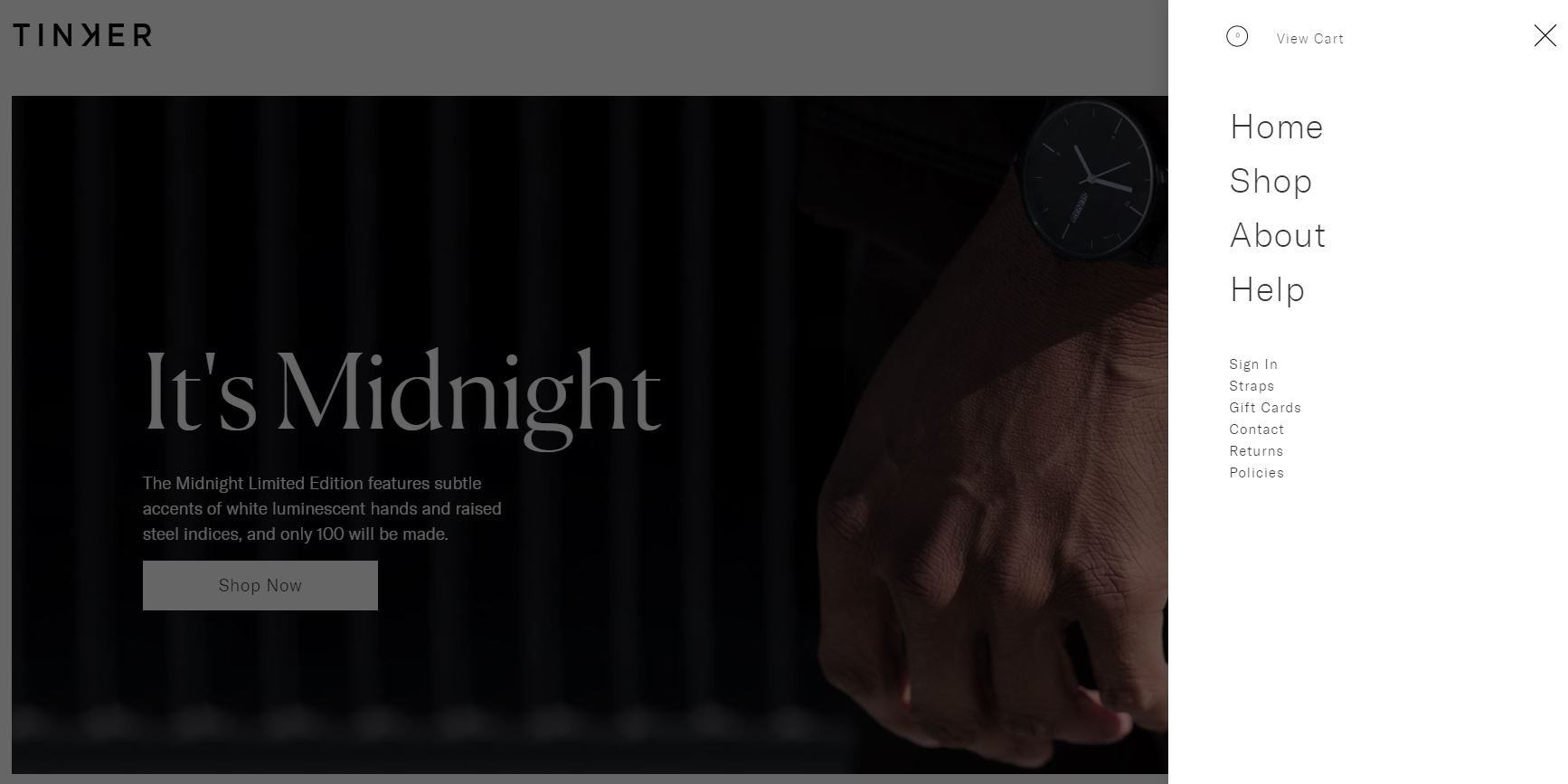
- Tinker: A watch-selling website that offers a clutter-free design and smart navigation:
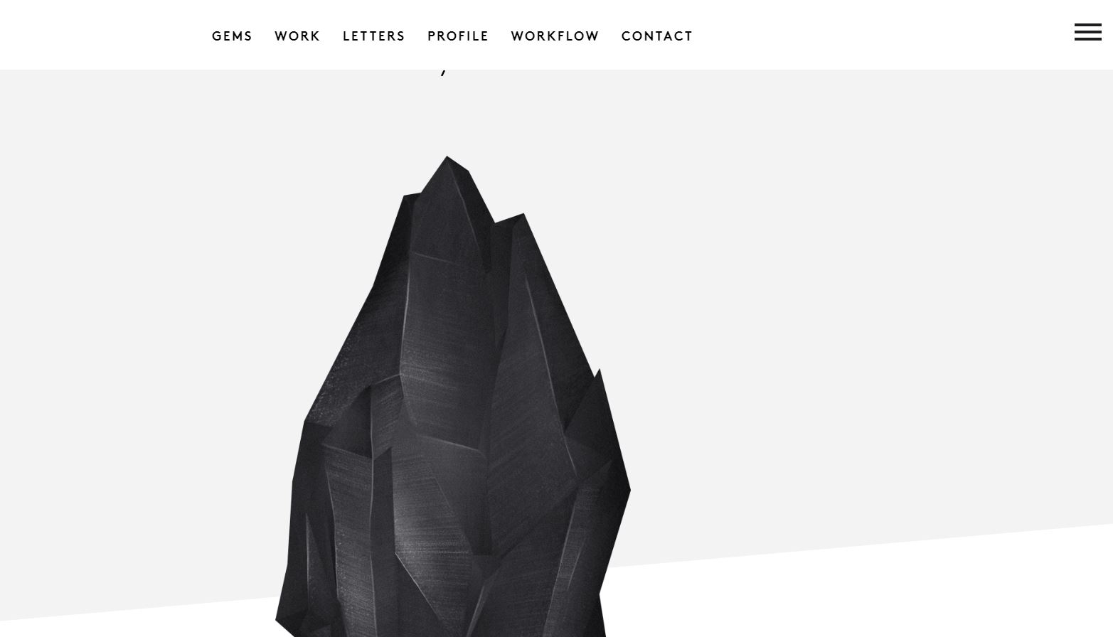
- WeAin’tPlastic: This website uses the concept of ‘stark contrast‘ in an ingenious manner. Apart from the obvious white-black color scheme, it utilizes size as a contrast metric between the central image and the text and icons:
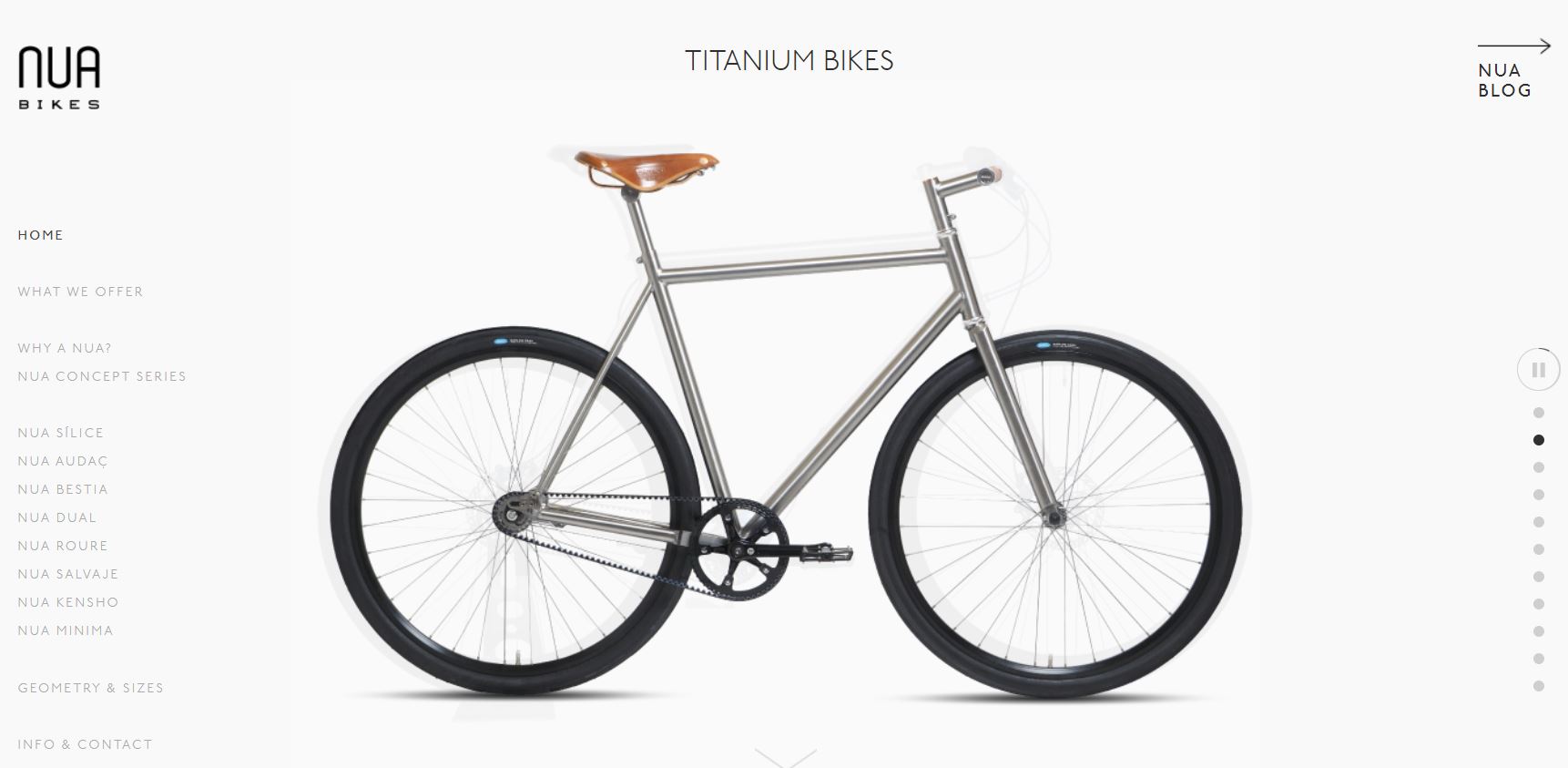
- Nua Bikes: Despite having multiple elements on the screen, this website makes effective use of white space by condensing the text and drawing attention to the main product:
Key takeaway: When creating the navigation, ask yourself these questions: “How will my users feel when they navigate the website?,” “Are the buttons easily visible?,” “Is my website easy to use?,” etc. All in all, when it comes to navigational style: go intuitive and stay natural.
-
Focus on the website’s aesthetics
“Design is intelligence made visible.” — Alina Wheeler, Author
Like all things beautiful, your website should also be aesthetically pleasing. This is where critical landing page elements like color, images, and text can help by offering a higher visitor turnout. Let’s look at some real-life examples to understand this concept better:
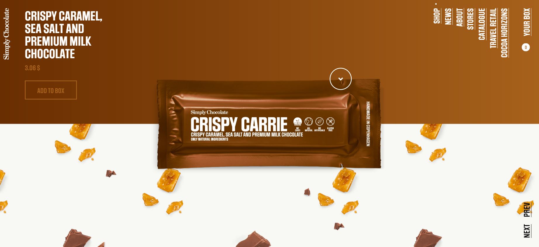
- Simply Chocolate: A clean-looking website with crystal-clear visuals, spot-on color scheme, clever CTA placement, and an unusual navigation bar that catches the eye. What’s not to like?
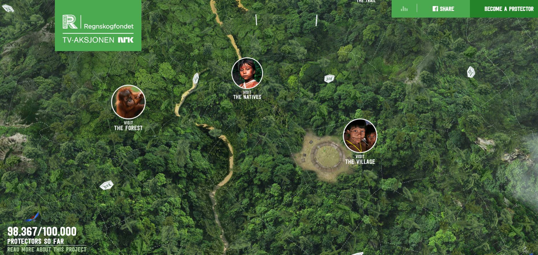
- Rainforest Guardians: This Not-for-Profit website follows an intuitive design style and integrates immersive 3D technology into design. Granted that this website takes longer to load, but in its defense, it offers unparalleled interactivity by allowing the reader to “visit” the various villages and waterways that make up the Amazon Rainforest. It also showcases ‘donor names’ to connect with the visitor on a more personal and intimate level. Cool, right?
When it comes to the industry best-practices, industry experts claim these are the top trends that will define website aesthetics in 2020:
- Dark Design Studio: An expert at the DarkDesign Studio summarizes this concept beautifully: “I believe that one of the main trends of 2020 will be dark design, mainly focusing on UI design giving users an option to enable dark theme. Dark backgrounds make design elements stand out more, creating a higher contrast ratio with the use of other colors, but still improving visual ergonomics by reducing eye strain.” No wonder iPhone too released its dark mode recently.
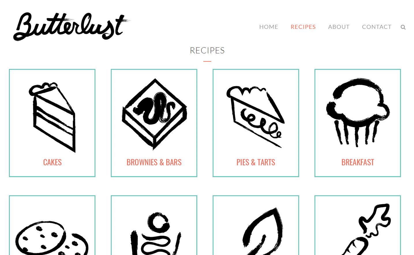
- Hand-drawn icons and illustrations to invoke a sense of positivity and humane personality to the website: The Butterlust website is a perfect example because messy looks great sometimes, right?
- Experimenting more with photography and graphics:
“Using real photographs mixed with illustrations or graphics communicates a customized message. Whether photos of products or people, these images can more fully support branding and help websites stand out from the crowd.” – Hiroshy
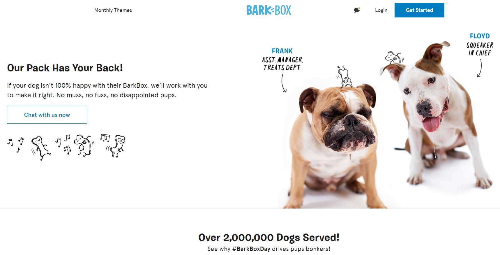
BarkBox‘s website is a dream for every dog-lover. It effectively combines relevant copy, great photography, cutesy graphics to deliver a heart-warming customer experience:
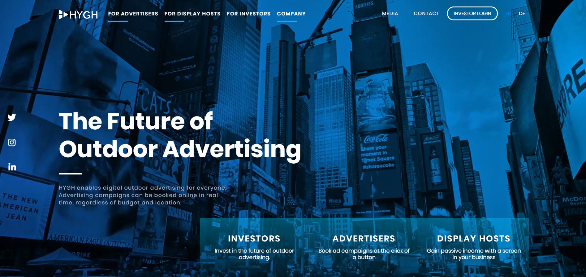
- Glowing, futuristic color schemes: Hygh’ website design makes a compelling case in point:
Key takeaway: Simply put, website aesthetics are like the topping on your cake, the remote to your TV, the butter to your bread. Without it, the experience feels incomplete and ‘bland’.
-
Invest in technical requirements of the website
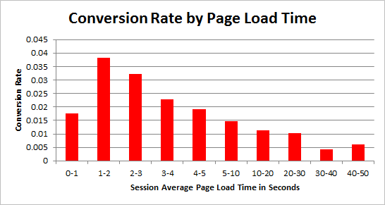
Let’s get one thing clear: Your website can be the “Steve Jobs'” equivalent of the digital world – complete with gorgeous design and minimal copy, but if the website takes more than 3 seconds (you read that right) to load, you can say goodbye to your customers. In fact, data suggests that the bounce rate triples – reaching 90% – if the website takes 4 seconds or more to load.
That said, it is important to optimize technical requirements on your website, such as improving your page speed. Even a 1-second delay can lead to:
- Reduced page views by 11%.
- Lowered customer satisfaction by 16%.
- Reduced conversion rates by 7%.
So what are some of the key metrics you should keep in mind when designing a website that loads at lightning speed? Here’s a handy list:
- Conduct speed tests.
- Optimize images and videos in terms of size and platform being used, such as smartphones, tablets, desktops, etc. Also, refrain from using ‘autoplay’ elements, which are downright annoying.
- Use minimal (and only necessary) plug-ins, without compromising on functionality. Also, make sure that your plug-ins are always up-to-date.
- Lower multiple HTTP requests by organizing and structuring it optimally.
- Enable cache and eliminate unnecessary redirects.
Key takeaway: Here’s an eye-opening statistic for you: A single second could cost $18 billion annually because of abandoned shopping carts. So make sure your website loads quickly and delivers a positive performance to users.
-
Implement live chat support for real-time communication
“The global live chat software market size is projected to reach $987.3 million by 2023.” – KBV Research
In terms of the benefits of using a live chat interface, where do we begin? Here’s a comprehensive, research-backed list for your reference (thanks to Finances Online):
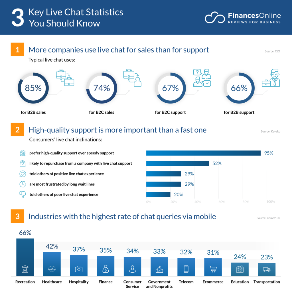
- Allows your business to be available 24×7 and offers round-the-clock support: There is no doubt that chatbots and AI are redefining mobile marketing and a host of other industries. You can benefit from the speed and accuracy these artificially intelligent machines can bring once they’re seamlessly added in your daily operations.Ultimately, chatbots can help you save on operational costs while adding customer convenience. As they get better, so does your company’s performance.
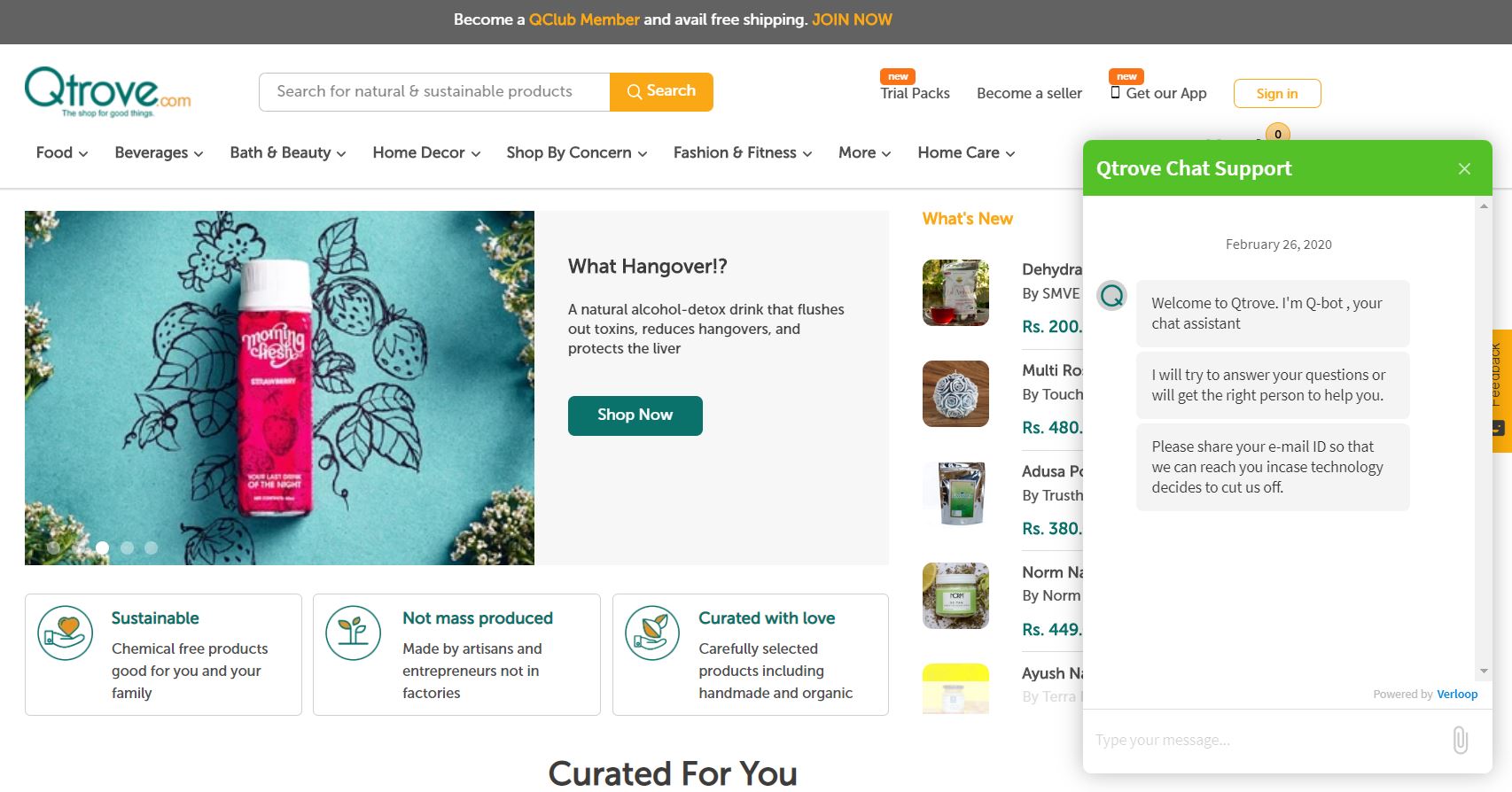
- Helps generate leads and bolsters the company’s image in a positive direction: More and more customers today want a personalized touch to their conversations. This is where live chat agents should take heed and use ‘canned messages‘ only when necessary.Here’s a great example of a personalized live chat conversation from Qtrove:
- Boosts sales and conversions: One of the most profitable and useful features of using live chat software is that you can integrate it with your email and/or VoIP (Voice over Internet Protocol). This ensures that no customer queries go unanswered – whether on chat or call.“By 2020, customers will handle 85% of relationships with organizations without human involvement.” – Gartner
- Enhances the overall customer experience: Data suggests that 50% of customers who visit your website on their smartphones ‘expect’ live chat services. Additionally, AI-powered live chat services reduce the burden on human agents and help deliver a seamless, quality-driven service to customers.
- Helps you collect important visitor information: Live chat can also be used to create customized pre-chat surveys that collect important data relating to your customer, such as name, email address, special interests, etc. This data mine can be further used to route the customer to the appropriate department, thereby saving time and offering a seamless CX.
- Targets returning customers (without being annoying): One of the best ways to reel in a returning customer is by preempting the customer’s needs and offering sales and discounts at the right time. A proactive chat with the necessary live chat triggers can decrease cart abandonment rates and boost conversions.
- Offers innovative features such as co-browsing: Co-browsing is essentially a screen-sharing feature that allows the agent to point, scroll, click, and annotate within your customers’ browser tabs, no matter where your customers are on your website or mobile apps.
This feature is indispensable from the user’s point-of-view. According to Forbes, “Co-browsing, or an agent accessing the customer’s browser simultaneously, generates higher satisfaction with 6 points more than the average session.”
Key takeaway: Live chat doubles up as the simplest, fastest, and most accessible chat support platform. That’s probably one of the reasons why Gartner predicts: “By 2021, more than 50% of organizations will invest more on chatbots development than the customary mobile app development.”
-
Do A/B testing frequently and passionately
“A user interface is like a joke. If you have to explain it, it isn’t that good.” – Martin Leblanc
Ever wondered what might the most optimum version of your landing page look like?
How about your website’s typography? Are you readers going to like/hate it? Here’s what Web Designer Depot recommends:
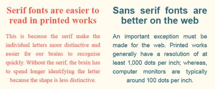
Is the font size going to give the readers a seizure or make the reading pleasurable?
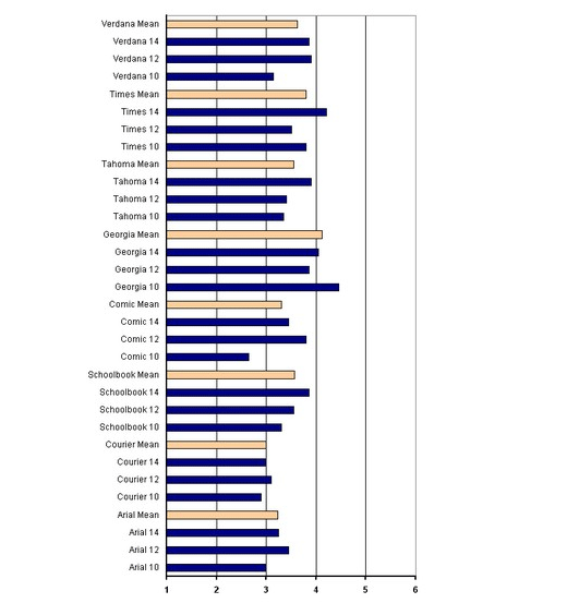
What about the typeface? Here’s a list of common typefaces you can test simultaneously to understand which one will suit your website the best (courtesy of Neil Patel):
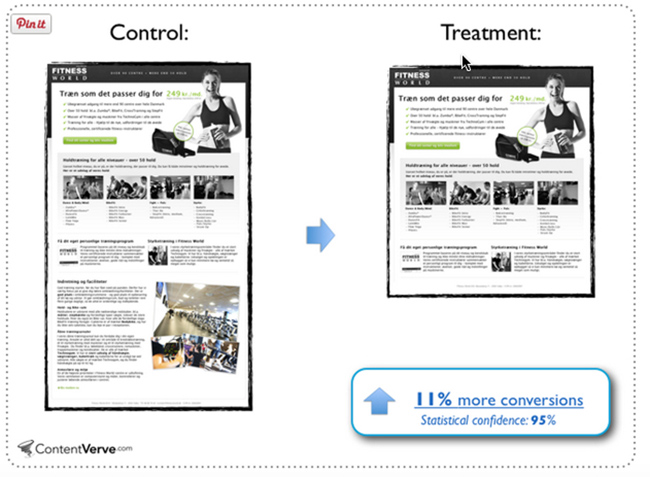
Should you opt for the long-form copy or the short-form one? ContentVerve gives us a hint:
You catch the drift, right? A/B testing is the process of comparing two versions of any marketing asset (think: website, email, etc.) with just one differing element. Based on specific metrics (conversion rate, time spent on the page, etc.), this test allows you to understand which version of the asset is striking the right chord with your target audience.
Handy tip: Key ‘unconventional’ areas that you can test from time-to-time include:
- The positioning, color, and text for the Call-to-Action button
- The kind of pricing schemes you’d like to put up on your website (Think: Freemium, Free Trial, etc.)
- Background images and patterns
- Navigation links
- Contact form fields
- Single-step checkout process
-
Leverage user-generated content for authenticity and credibility
“93% of millennials access social networks on smartphones today.”
UGC on your mind lately? If not, well, it should be. Data predicts that millennials are spending around 2 hours and 38 minutes on social media each day – that too, multi-networking between 9 social media accounts!
So how does this revelation tie to brands using UGC to their advantage?
First of all, research claims that “51% of Americans trust user-generated content more than other information on a company website.” Here are a few examples that prove that brands that utilize the power of user-generated content stand head and shoulders above their competitors:

National Geographic aced its UGC strategy by asking users to take snapshots of people, places, and experiences from their travel adventures. The users had to share their inputs with the hashtag #wanderlustcontest on Instagram and earn points:

Lucky winners with the maximum points were awarded a National Geographic Photo Expedition to Yosemite National Park.
All in all, user-generated content can be anything from text, videos, images, or GIFs provided by your brand’s users, which helps to establish brand credibility and trust among your target audience. Perhaps James McClure was onto something when he said: “Your community, your customers, are the best marketing asset you have.” Agree?
Did You Know?
Facebook Ads, having UGC, boast of a 300% higher click-through rate (CTR) and up to 50% lower cost per click (CPC).
Over to You
When it comes to UX strategies, there’s no “one-size-fits-all” approach that works. Every website, like its owner, should have a distinct personality and speak to the reader in a language they understand. This is where deploying the right UX tactic can make all the difference.
Now that you have a better understanding of how to align your user’s requirements with your website offering, put your thinking cap on, and experiment away!
If you think we’ve missed out on any interesting hacks and tips, we’d love to hear about them. Leave your comments below.