Creating an email sounds simple, but it’s a lot more complicated for marketers.
When you’re an email marketer, you have to illustrate designs and craft templates to get your leads moving along the sales funnel. For every message you send, you have to monitor open rates and response rates. Plus, you have to create personalised copy for each customer segment, and so on.
There’s a load of things to do and a long list of messages that need to be sent.
While it doesn’t seem glamorous, some have made a living from creating outstanding campaigns. Not only have they mastered the art of persuasive copy, but they’ve created aesthetically pleasing emails that can make readers stop and stare.
If you want to follow in their footsteps and generate results, here are some awesome marketing email examples that you can steal.
1. Dollar Shave Club (Abandoned Cart Email)
The average rate for cart abandonment is around 69.57%.
In short, 69 out of 100 shoppers walk away from their shopping carts…which is a lot of customers.
This abandoned cart email from the Dollar Shave Club has a lot of elements that make customers return to the online store. They include free shipping, fast delivery and the benefits of buying their razors.
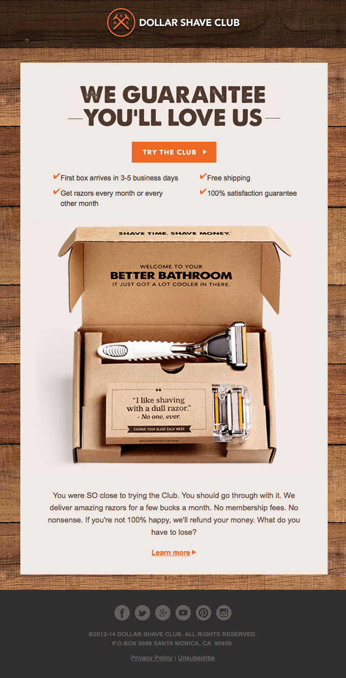
To make it more convincing, Dollar Shave Club’s marketing team includes a high-quality image of the box that customers will receive. They have structured email headings so users can easily navigate the message and see a noticeable CTA.
Also, they emphasize that there’s no harm in trying out their product. There are no membership fees and customers can receive a refund. If they want to learn more about their razors, they only need to click the link to the website.
2. Hers (Survey Results Email)
Subscribers love to read about trends and studies related to their industry. This is usually sent in the form of a downloadable ebook or a link to a press release.
Hers – a shop for women’s health and personal care – likes to keep it simple. They have a concise description of each result which is divided into several boxes too. Each box has a distinct color and a clean layout. The illustration for each result commands the reader’s attention.
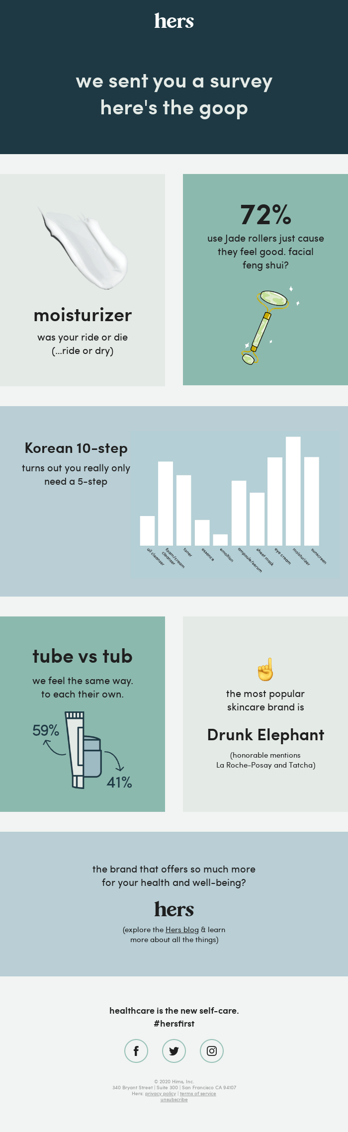
For example, one box is dedicated to the use of jade rollers, and it includes an illustration of the item too. Additionally, the graph helps readers interpret the information.
At the end of the email, readers have an option to visit the blog and learn more about health or well-being from their website. They can also place logos to their social media profiles in Facebook, Twitter, and Instagram.
3. Squarespace (Onboarding Email)
First-time customers rely on onboarding emails, especially if they opted for a free trial. They would need tutorials, emails, ebooks and premium content to guide their purchase decisions. If they aren’t satisfied, then they won’t convert in the long-run.
Squarespace’s onboarding email gives first-time users a free trial. This lets them create a free website and pay for the additional costs via a simple subscription. Also, they offer helpful guides and how-to-videos that inform users about the content creation process.
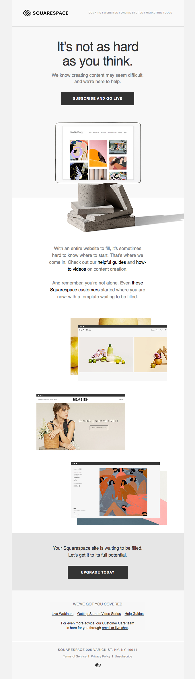
Sample website layouts are placed near the bottom of the page to show what Squarespace is capable of. The consistent white and gray coloring makes the email seem simple, but sophisticated.
4. Fortnum & Mason (Product Launch Email)
Fortnum & Mason’s email does a great job at promoting their product… because it doesn’t feel like they’re selling anything. Instead of telling people to buy their chocolate cookies, they are told to “Bend The Knee To… The Mighty Chocolossus”. It also tells a fun story of gigantic chocolate biscuits that are armoured inside a magnificent tin.
We love the image of Fortnum & Mason’s cookies literally towering beside a golden container. Customers might not be able to touch the biscuit in real-life, but the image alone can spark their curiosity. They also provide details of the ingredients with descriptions like “dark chocolate” and “macadamia nuts” pointing to the sweet treats.
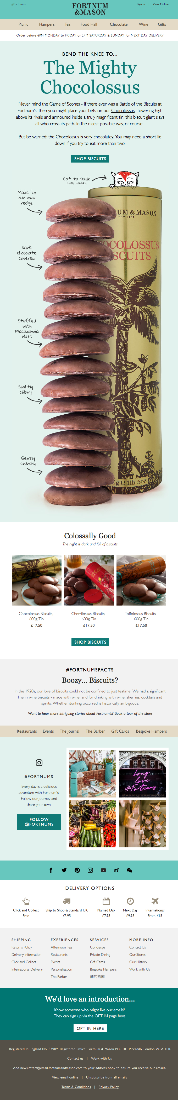
Consumers that are surprisingly not interested in the main product can check out the product recommendations below. They also share their brands story in the #FortnumsFacts section with a navigation bar to the different sections of their online store.
Fortnum takes its photo curation seriously so they showcase a sample of vibrant pictures when promoting their Instagram page.
5. Freshly (Discount Email)
Discounts are an effective way to promote your products and increase customer lifetime value.
In fact, Convince and Convert reports that 93% of shoppers use a coupon or discount code throughout the year. 75% of consumers even make an extra effort to search for discounts in their inbox.
While we’ve seen many discounts in our inbox, Freshly’s email manages to stand out from the crowd. Like what their email suggests, customers can get $30 off their first and second order.
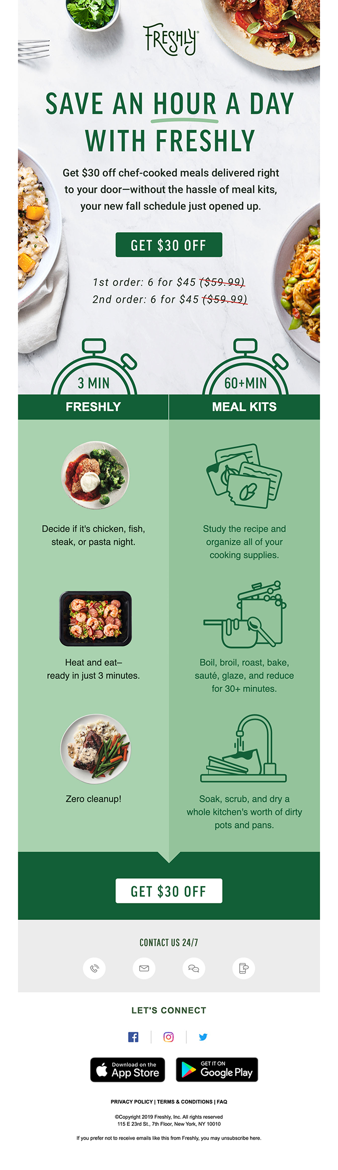
The main benefit of buying their meal kits? Customers can save an hour a day. All they need to do is study the recipe and follow simple instructions.
6. CJU19 (Event Email)
Businesses hosting events can also use email marketing to convey relevant information to guests.
CJU19—an annual conference—uses emails to prepare their attendees. They send an interactive list of items that people should keep in mind as they pack their bags.
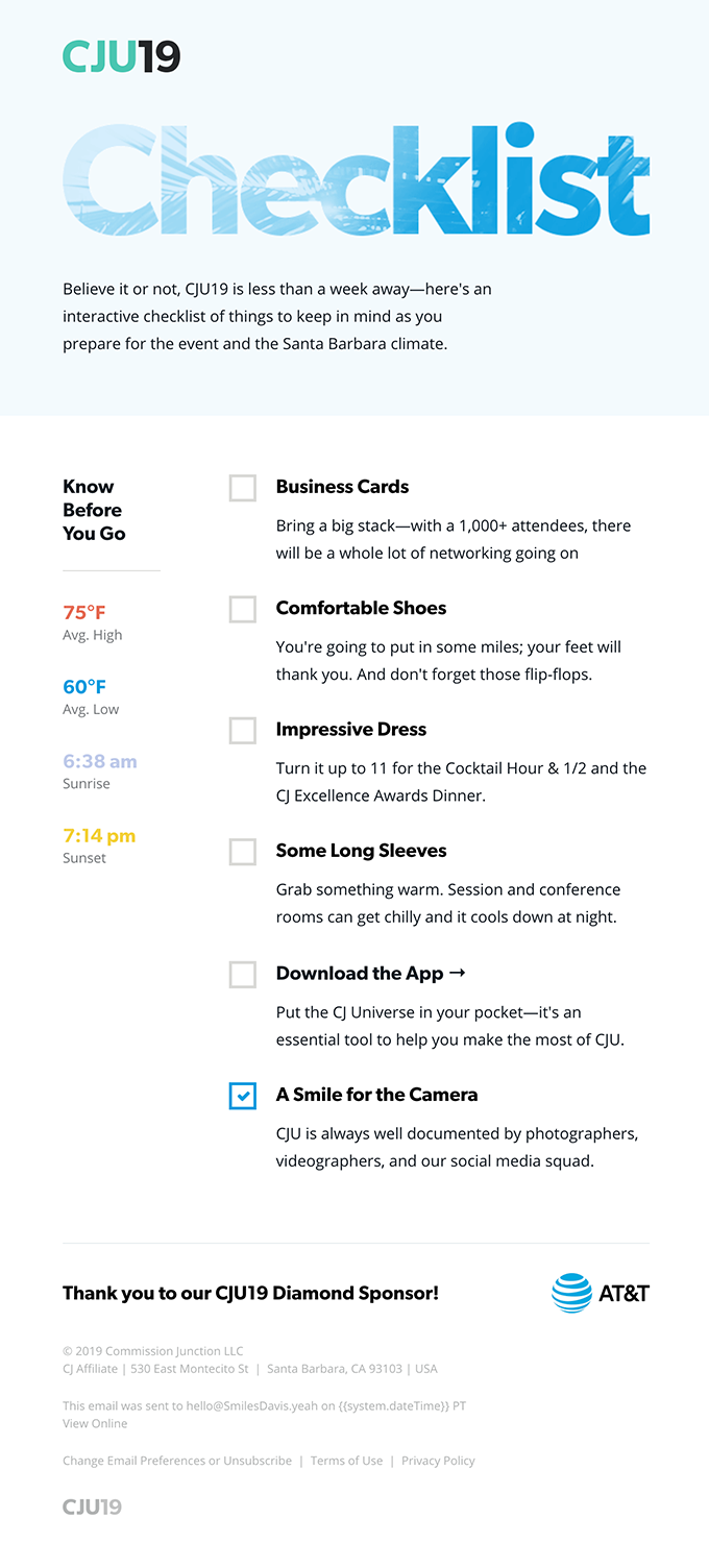
We are fans of the simple light blue and white color scheme. The word, “Checklist” is the main heading and it has a unique design that can immediately draw your attention. Since they expect international attendees, they mentioned the temperature and time of the sunrise or sunset in the area.
The main must-have items are highlighted in bold. It also includes a short rationale for bringing the items so it stays at the back of the reader’s mind.
7. Roadtrippers (Newsletter)
Many brands use newsletters to keep their business on top of their customer’s minds.
According to Parse.ly, newsletter readers spend 80% more time on their website. For the New York Times, their newsletter readers are likely to consume twice as much content than those without it, and they’re twice more likely to turn into paid subscribers.
Here’s an outstanding newsletter from Roadtripper. The email inspires travel lust by sharing stories about road trips to the jungle, winter wonderlands and towns.
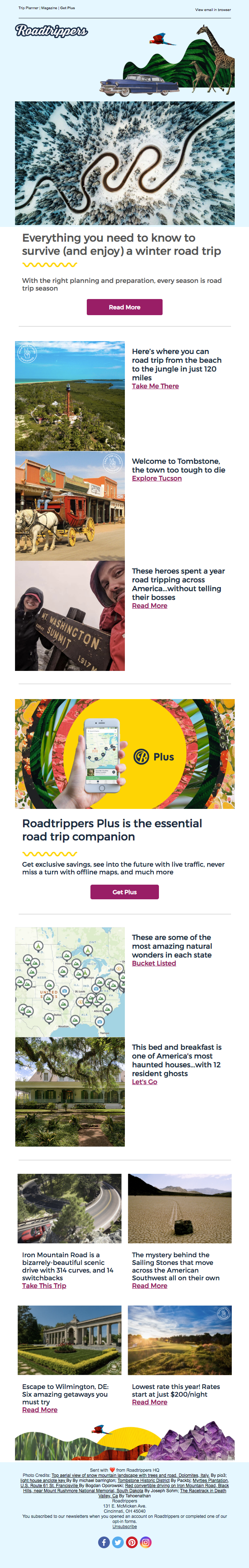
The business uses negative space so it’s layout remains clean all throughout. Stunning pictures of the destinations compel readers to click a story and consider a road trip.
The middle section is dedicated to the Roadtrippers Plus app so users can get information on exclusive savings, live traffic information, and offline maps.
Ready to Create Your Own Email?
When it comes to email marketing, design and copy are key.
Make a few colours prominent to keep the layout clean and simple. Use high-quality photographs to compel readers to check out your website.
The message is equally important. Write a copy that will resonate with your readers. Is your brand funny, entertaining, chic or sophisticated? Be creative in telling your story.