
In the world of digital marketing, you set your brand apart from your competitors through content marketing. It’s one of the best ways to connect and build a relationship with your audience, as well as establish your authority in the industry. World-renowned marketer Seth Godin even said that “content marketing is the only marketing left.”
However, if your content isn’t well-optimized for conversions, you’re bound to miss out on a lot of opportunities. You’ve spent too much time crafting valuable content for your audience, so you should exert the same amount of effort in optimizing content and building high-converting blog pages for more leads, which means more returns.
But is it enough to have good quality and valuable content in your blog?
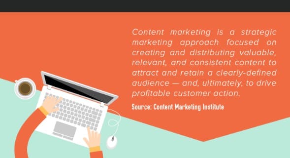
Let me remind you of the definition of content marketing:
How do you know if your blog is doing well?
The common notion of some bloggers and businesses is that your number of visitors is the best metric to measure the effectiveness of content marketing. Sure, it’s one good indicator that a piece of content is good, but having massive pageviews DOES NOT equate to more sales.
Visits are a “vanity metric“. They do not necessarily correlate with the important numbers like engagement and profits. Statistics show that 62% of marketers said the number of leads they get serves as a sign that their content is working. If you’re running a blog for your business and you’re only focusing on investing in blog posts that drive a ton of traffic instead of blog posts that bring you customers, you might just be wasting your time and money.
For B2B organizations, the ultimate success metrics usually relate to an increased number of leads or direct sales. It’s normal for visitors to turn into potential customers because they read compelling article. Around 85% of marketers say lead generation is their most important goal. Your content may rank well, but that doesn’t mean it brings the right traffic and right leads.
Here are some metrics to look into to measure how your content performs for lead generation:
- Click-throughs – Calculating click-through-rates (CTRs) can help you understand how your blog articles and which types of content are generating and converting leads.
- Conversions – This rate shows which pieces of your content are the most effective in turning qualified leads into clients. Roughly 47% of marketers consider the conversion rate as a key content success metric.
- Average close rate – This refers to the rate at which your leads turn into revenue. You can calculate this by dividing the total number of sales closed by the total number of leads generated.
If you’re running a personal blog,
Are you satisfied with getting traffic? Sure, you might be blogging just for fun, but it won’t hurt if your blog could also bring in additional income, right? Some personal bloggers monetize their blogs through banner ads and sponsored posts. Meanwhile, some bloggers manage to become influencers in their niche and offer workshops, consultations, and even set up online shops.
You should be treating your blog like a business. “If you treat your business like a hobby, it will cost you like one. If you treat it like a business, it can pay you like one.”
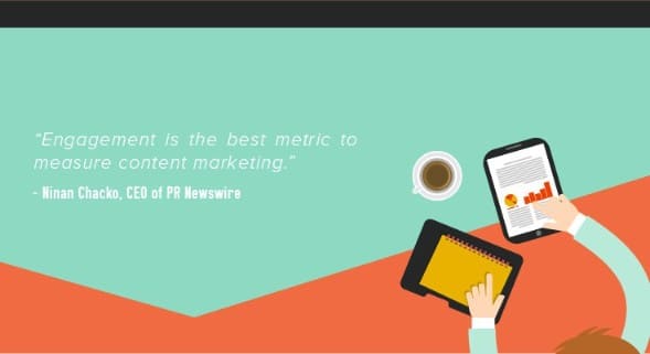
Are your readers engaged?
Whether you’re running a business or a personal blog, don’t obsess about the number of visits. Focus more on how you can improve your engagement. Are your visitors commenting, reading your other posts, clicking on other pages, curious about who you are and what you have to offer?
Turn readers into customers with blog design
While it’s true that “great content is the best sales tool in the world” (according to The Sales Lion founder Marcus Sheridan), you also have to back up your awesome content with specific tactics from other marketing disciplines to make it work.
SEO strategies can help you rank your blog for specific keywords and win with organic traffic. Here at Spiralytics, we also work closely with our amazing design team—not just for our blog banners and infographics, but with blog layouts too!
We’ve blogged before about why you should be doing more visual content marketing to make your content stand out. Aside from data-driven content plans, part of our content marketing work includes enhancing our clients’ blogs to increase conversion. We don’t just make our clients’ blogs look appealing, we also create blog designs that translate to engaged readers and qualified leads. After all, a blog isn’t just to create a connection with their target market but to also earn money from it.
There’s no cookie cutter formula for a high-converting blog. However,
We’ve learned through our client blog performance reports that a blog layout template we’ve customized (taking inspiration from various successful case studies) helped increase engagement and conversion.
This infographic below presents our go-to blog layout that we recommend for our content marketing clients. The design may vary depending on the products/services offered by the client but we still follow the structure and tweak it to achieve our content marketing goals. Each element is crucial, regardless of the size they take up in the layout. The illustration explains each element so you can understand how they work individually and in the overall design.
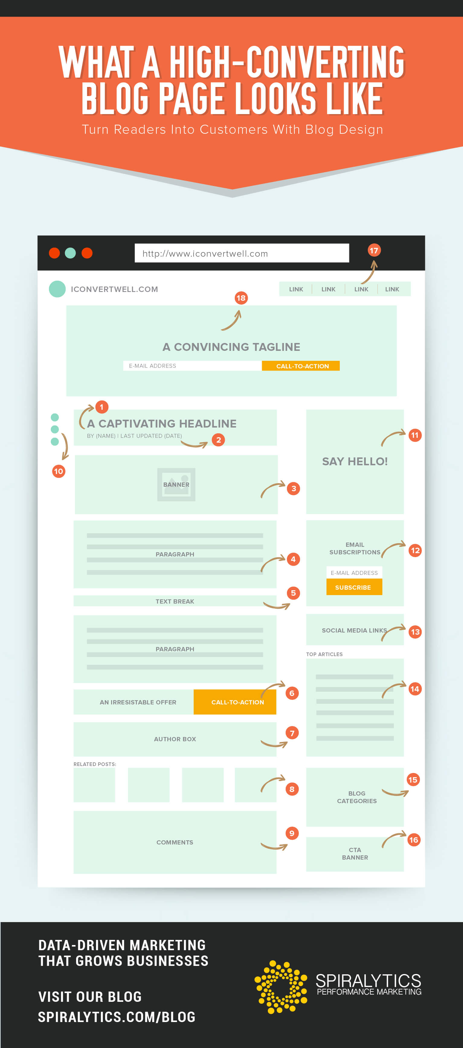
A. The Blog Post
-
Headline
A headline that will entice your reader into clicking “Read More” is one that is informative (without giving too much away), catchy, and lets your reader instantly understand what the article is all about before even reading the content. List-based headlines are popular among readers (36%).
For instance, ‘5 Tips on Writing Snappy Email Subject Lines’ instead of ‘How to Write Snappy Email Subject Lines.’
-
Byline and Date
One goal of content marketing is thought leadership—to build influence in your niche. One good way of establishing yourself (or brand) as a thought leader in the industry is by putting your name in the byline. Some websites like HubSpot even put a photo of the author and their Twitter handle in the byline.

In terms of date, which blog post do you think would be more valuable and relevant to a reader:
- An old, untouched post from 10 years ago
- A comprehensive post that gets updated every year
The answer’s quite obvious. Both search engines and readers naturally consider blog posts that are recently published or updated to hold more value and relevance than those that were published five or more years ago. Including a time stamp is especially useful for evergreen blog posts that feature constantly changing content or updates in specific industries for example.
-
Banner
What grabs your attention when you scroll through your Facebook newsfeed? Photos.
Studies show that people can recall 65% of the visual content that they see even after three days. With millions of content shared every day, you’d want a banner image that not just supports your headline but also captivates your target reader enough to click the post and go to your website. There are a number of free photo websites you can use to source visual material.
-
Content
“A great headline mixed with a lame opening is like inviting someone into your house, only to slam the door in their face as they approach.”
– Brian Clark , Copyblogger founder
Start your article with a question, tell a story that readers will be able to relate with, or shock them with interesting facts. Make your introduction brief, snappy, and interesting to hook your readers and make them curious about the rest of the article and eventually curious about you and your website.
-
Text Break
Text-heavy posts are a big turn-off for readers. Don’t write posts in a big block of text. You can break down the content by using bullet points , writing lists, and using subheadings. You can also break your post by adding images or videos. Statistics show that blog posts with images receive 94% more views.
-
CTA Below Post
Congratulations, you got your reader to scroll to the bottom of your blog post! Now’s your chance to showcase your product/services with a Call-to-Action, especially since over 90% of visitors who read your headline also read your CTA copy. You can create CTA banners for the ff goals:
- Drive them to your services page
- Drive them to your Contact Us page
- Offer something FREE
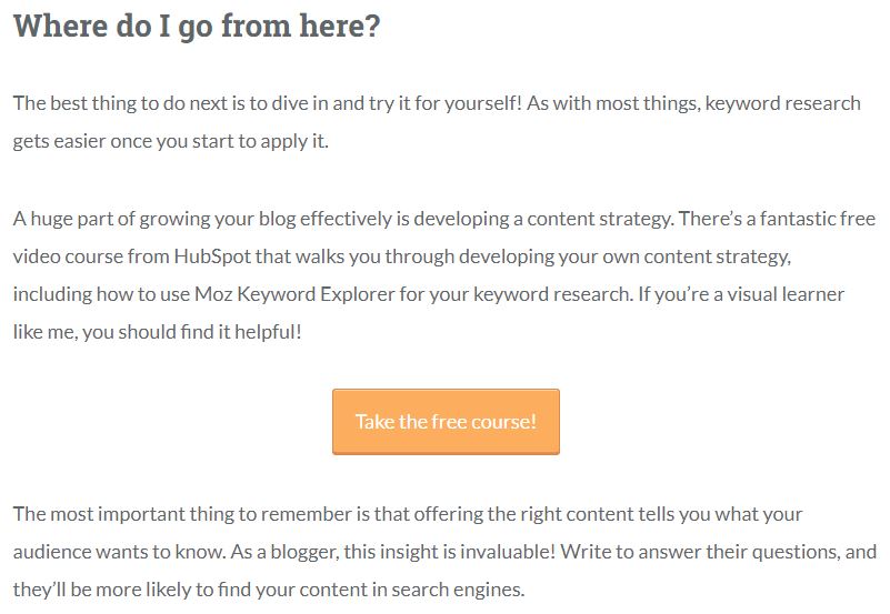
A great example of this is Moz, where they often end their blog articles to promote a free downloadable eBook or course related to the blog post.
-
Author Box
In #2, we mentioned the importance of putting your name, photo, and Twitter handle in the byline. In the author box, you can write a short paragraph to introduce yourself, and put links to your other works, social media accounts, or websites. Make it easy for readers to find out more about who created the content.
-
Related Posts
Don’t settle on driving traffic to a single post, instead your goal should be to make your reader stay in your website and make them read more articles. This eventually introduces them and piques their interest about your products and services.
Let your reader know that you have other valuable content that they might be interested in by displaying related posts under every article (like the ones you’ll find at the end of this post).
-
Comments
Blog comments are a great indicator of engagement. Not only does this allow your readers to give feedback on your post, you can also gain insights and interact with them (and potentially make a sale). Respond to people who leave comments on your blog even if they’re not asking questions.
Moz authors are excellent examples of this, as they’re responsive to comments. This helps to build your influence in your niche and make friends with other influencers to widen your network and reach.
-
Social Media Sharing Buttons
Make it easier for your readers (and encourage them) to share your blog post by adding social sharing buttons in every post. You can place them at the top, bottom, or either sides of the post, in-line with the post, or use floating bars. We position ours as scrolling buttons on the right hand side.
B. Sidebar
The order of elements in your sidebar will depend on your priority customer action. Feel free to rearrange.
-
About You
This is the space where you get to introduce yourself and the blog to your readers. Think of this as your elevator pitch, briefly explaining why they should follow your blog. You can put a nice picture in there to grab their attention.
-
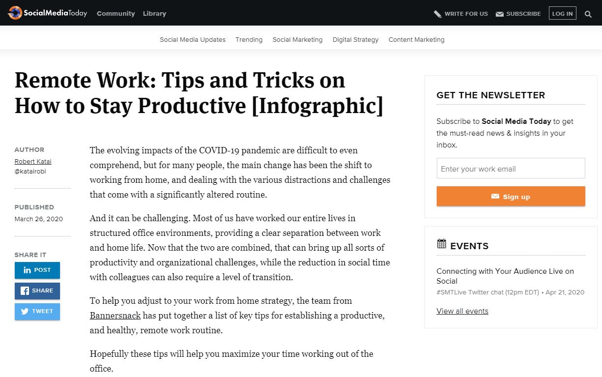
Email Subscription
If getting emails for your database is one of your priorities, then you can put this up higher in the sidebar. Write a one-liner (or two) to convince them why they should subscribe to your newsletters. Make sure that the subscribe button’s color pops up to catch their attention too! Take inspiration from Social Media Today:
-
Social Media Links
While your goal is to make your reader stay in your website, you should also promote your brand’s social media accounts for them to follow so that they’ll always be updated on your latest posts and offers.
-
Top Articles
Similar to Related Posts under each blog post, display your Top Articles on your blog’s sidebar to encourage users to read them and stay on your website like what Content Marketing Institute does:
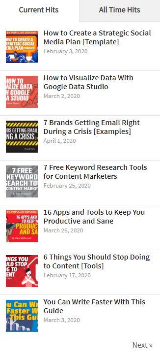
Aside from listing them down, you can also use custom thumbnails of your top performing posts.
-
Categories
Another way to make users stay longer on your website is by displaying more of your articles by category.
-
CTA Banner
Like an ordinary ad banner, you can create a custom ad for your business and showcase it on your sidebar. Your goals can also be the same with the 3 mentioned in #6.
C. Header
-
Navigation
Make it easier for your readers to find your most important pages. Also, your header should appear on every page of your website and not just on your blog. These can be your Services page, Contact Us page, About Us, etc. But this as simple as adhering to good general website design practices.
-
Hero image + CTA
As Shopify puts it, if your website is a piece of real estate, this area of your website is a prime location. This serves as the most seen part of your page so you have to maximize it.
What should be included in your hero image? Some websites use an eye-catching image, it depends really on what you want to put emphasis on. In Spiralytics, we believe that with or without an image, it should have:
- a convincing tagline/copy to make them do a customer action and
- a strong Call-to-Action. For example, we keep ours short and direct, encouraging our visitors to contact us for a free assessment.
If you really want to be aggressive,
Here are other highly-recommended blog features outside the layout that you can install:
-
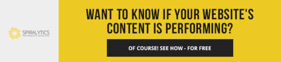
An attention-grabbing bar at the top of your page
The horizontal bars, also called smart bars, rest at the top of your page are often in striking colors and a convincing call-to-action. Some examples of these are the Hello Bar and Attention Grabber.
Digital Marketer utilized OptinMonster’s Hello Bar alternative and saw a 8.45% conversion rate.
-
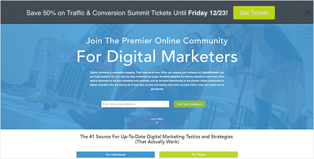
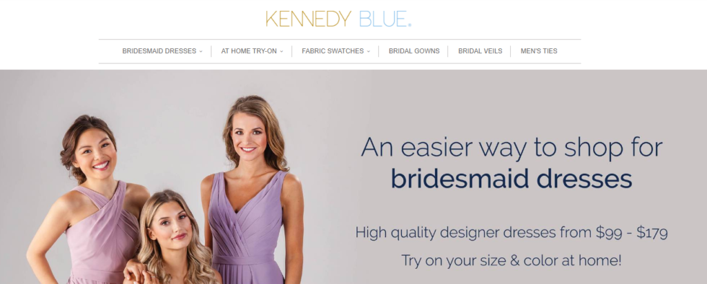
A Slide-in CTA
According to Hubspot, visitors learn to tune out static CTA banners. One way to grab the attention of users (especially returning ones who ignore your banners) is by installing a slide-in CTA. These banners slide in from the right side of your screen when you scroll halfway down a blog post, without blocking the post that a user is reading.
Kennedy Blue brought in 2.56% of readers to the front end of their funnel using a slide-in optin.
-
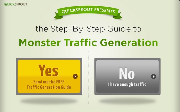
Exit Intent Pop-up
These things are amazing! Unlike the annoying pop-ups that randomly appear when you’re on a website, exit intent pop-ups only show up when it tracks that you’re leaving the website. A little creepy, but smart. It also has an interesting CTA that “manipulates” you into doing what the website owner wants. Exit intent popups outdo traditional popups by 5%. Here’s an example from Quick Sprout. Would you really admit that you have enough traffic?
Are you already doing some of these and do they work well for you? Are you using other blog design elements that have helped you get more sales? Let’s discuss in the comments below!