Today everything we do is online. From social interactions to entertainment. A lot of people make they’re living exclusively online. And this all, of course, includes shopping as well. Most of our commercial transactions are done over the internet. If the internet is the new global marketplace of the world, eCommerce websites are the merchants. And any good merchant needs to know how to attract and keep clients, right?
In order to be successful, you always need to be in line with the newest user experience trends. Below you will find the most current tips, tricks, techniques, and elements that make up a good eCommerce design.
Mobile Friendly

A lot of consumers use mobile to browse the internet and to shop. If your website is not mobile friendly, you might as well not even have it. It’s all about smartphones, ease of access, and social platforms. In fact, 52.4 % of internet traffic is created solely through mobile devices. So imagine the profits you will lose out on if you don’t optimize.
Set up your website in such a way that it can be easy to access both on large-screened devices, and on mobile. Furthermore, try to set it up so that also handles social media. You will lose out on a huge number of leads if you don’t get mobile optimization.
Original Color Schemes
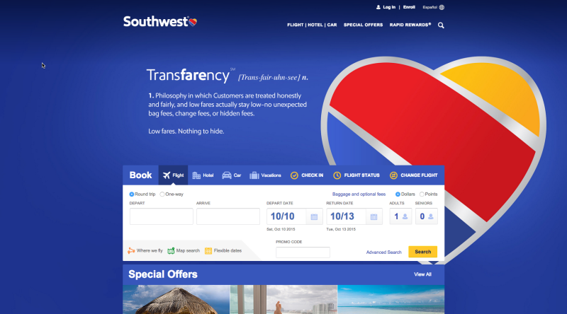
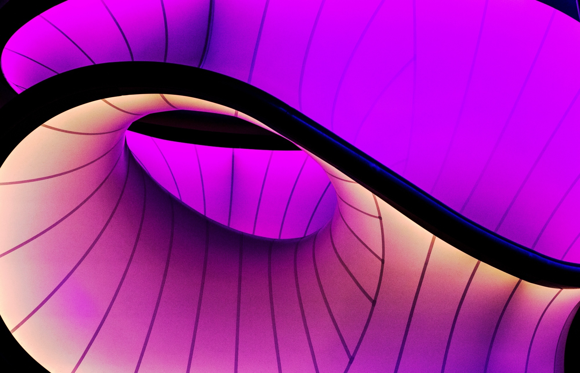
There are many mistakes when it comes to website design, but one of the worst ones that’s not talked about at all is boredom. Or, rather, lack of originality. We don’t mean you should set it up like an avant-garde experimental performance art thing. But we do mean you need to stand out. Southwest Airlines’ website is one of the best at this. With a beautiful and strange mix of colors, you won’t see a color scheme like this anywhere else.
Think about what kind of message you want to send. Use calm and warm colors if you want something relaxed and soothing. On the other hand, light blue, grey, and white give you a kind of serious, corporate look. It’s all up to you.
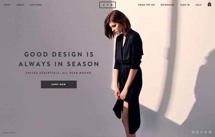
Simplicity and minimalism
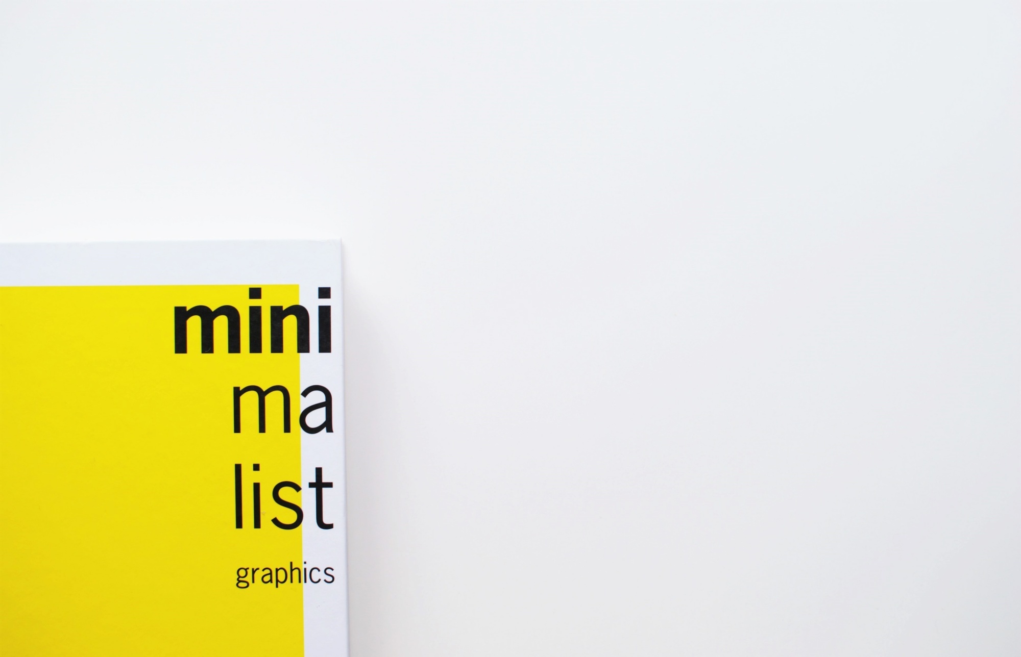
Avoid any unnecessary clutter. You want a website that is clear, functional, and to the point. It doesn’t matter if you are set in China, Singapore, Germany, or Australia, you want something universal. And minimalism is universal. The trick here, of course, is finding the balance. You want your website to look unique, while at the same time have a simple navigation system.
If you’re having trouble, listen to the professionals. The guys from Hopping Mad, a company working with web design in Sydney, suggest you go universal. Universal means the moment somebody sees your website, he or she will know exactly how to reach the page they want. Website navigation does not have its own language or culture. It’s either user-friendly, or it’s not.
Furthermore, don’t add anything you don’t need as far as content is concerned. It will just draw attention away from your actual business. Have your contact info be as clear as possible. If you’re going for that professional look, a minimalist website will give you this ascetic, stoic look and feel. It sends a message that you are all about business.
“Simplicity is the ultimate sophistication.” – Apple’s 1977 Marketing Brochure
The best example of a minimalism in design is probably Apple. For years, it was all simple, and clear. Streamlined, with a simple and recognizable logo, mostly in white, these products look futuristic even though they’re decades old. Furthermore, they transferred this onto their webpage for the iPad mini 4, showing an excellent example and precedent.
Illustrations
As eCommerce becomes a more important channel, you need to stand out more and more. That’s where illustrations come in. These are probably the most unique aspect of them all. Colour schemes and patterns only give you so much originality. But unique illustrations can really make your website pop. The problem here is just the fact that you need to find a good artist, and have a good idea. However, looking at successful websites as an example is very effective. Kitchen Sink Studios is one of the better examples if of successful illustration implementation.
You can go with simple or complex geometric shapes and patterns. Or, if you’re going for a more relaxed approach, cartoons, and caricatures. You can move from whimsical, to serious and professional. It’s up to you.
Animation
Similar to illustrations, animations on your website can really make a difference. You can add cinemagraphs, gifs, or even full videos to your website. If done properly, an animation can set an emotion and a feeling the moment you see it. It can present an idea or a motive. And, of course, it draws people’s attention and primes them for engagement.
For example, the website for Roll Park, a company dealing with parking solutions, uses animation to keep you interested and to show you exactly what you’re doing.
Now, of course, you need to see if it fits with your company. You do want to keep your eCommerce design focused on, well, commerce. Don’t go overboard, be subtle – this is a professional website, not a Tumblr page. As with most things, it’s a matter of balance.
Asymmetry
This is rather specific, but it is a trend that we have noticed has popped up recently. Sure, you want to stay professional, you are dealing with people’s money after all. But having a regular, “boxy” looking website will make you the same as any other company. And while you may notice the paradox of “following a trend vs. trying to stand out” now that there is this danger of ending up looking outdated.
Asymmetry is a trend that, while many people are doing it, can be executed in such a way that it’s pretty much unique every time. So kind of relax the structure a bit, keep it a bit “untidy”. Have a drop of chaos in your design. An excellent example of not only asymmetry but of a “broken” frame is the website for Remi Jousselme guitars.
Better typography
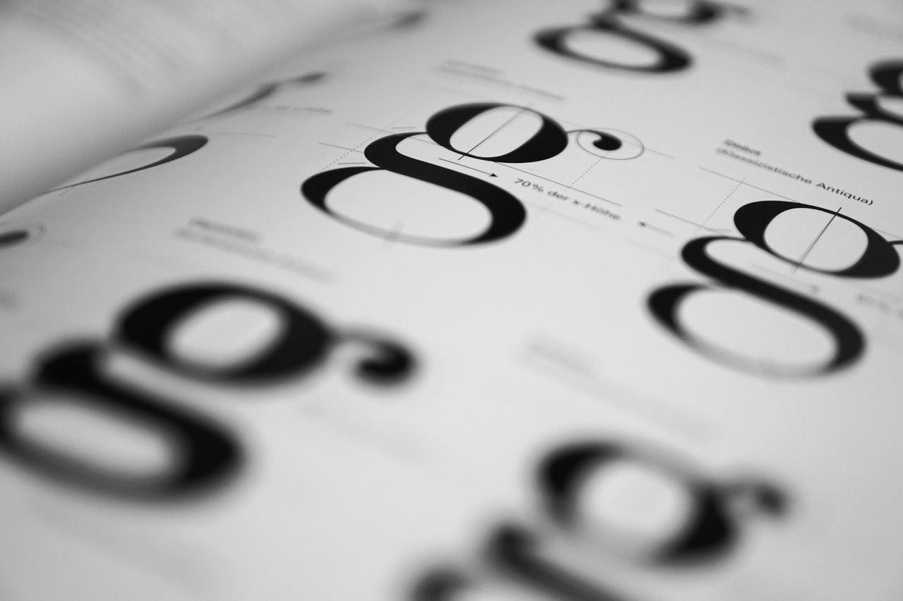
This one may sound silly, but trust me, at least think about it. A website page isn’t only images, illustrations, and colors. You also have words, you have letters and typing. They are just as an important element as colors are. So why not make them look better? You wouldn’t leave a website completely blank, would you?
The actual type of product doesn’t really matter. For example, the website for Journey Decals, a company that deals in vinyl car products, has in your face, clearer fonts and typography. Large and imposing, it really draws your attention in.
As the days go by, electronic screens are getting better and better, sharper and sharper. This means legibility improves, but also an eye for detail developed. People will notice subtle and simple fonts more easily than before.
Conclusion
The world of business is ever changing. That’s why you need to always be on the ball and stay up to date with the newest trends. Just keep all the above trends in mind, try to follow as many of them as possible, and you will definitely see your business grow.