


The importance of user experience (UX) in many things—may it be a website, app, or even with everyday stuff you often use—isn’t a new concept, but there’s no denying that the increased interest in it today in light of the technological revolution.
According to Impactbnd, 79% of consumers who don’t like what they see on your website will simply find another site to complete their task. This makes website UX useful, especially for business websites, as it means you’re less at risk of losing out to your competitors.
However, this didn’t stop a few companies from designing unpleasant pages. Here are a few examples of websites with bad user experience design.

At first glance, you won’t be able to tell what Arngren is all about (not because it’s in Norwegian, but because you’ll want to close your browser instantly). We can’t blame you either if you don’t know that it’s a classified ad site, because that information isn’t readily apparent.
The unorganized clutter is due to the page not using grids to separate the graphics, content, links, and other elements in it. Apart from that, it also has a poor navigational structure, the text is of different sizes and colors (making it unreadable), and the overall tone has no particular theme.
The first thing to fix here is the grid because it will help create a consistent, well-designed interface, where the elements are not too close to each other. Redesigning the site should start with making it more intelligible and less distracting.
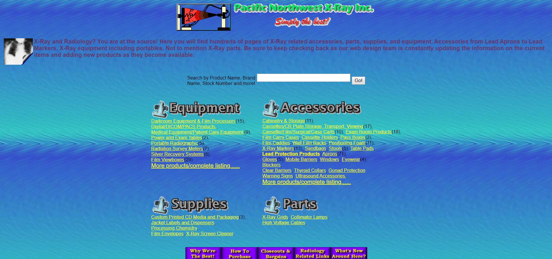
Much like Arngren, you won’t instantly know what Pacific Northwest does; but not because they didn’t explain it. You probably just decided to skip reading (or perhaps, failed to notice) the introductory paragraph in red—of all colors.
The website for this X-ray parts and supplies retailer has a confusing and unpleasant color scheme—the background clashes with the text and link colors used. Props for adding category lists for the products, but it would’ve been better to use a color that actually contrasts with the background so that the text isn’t blurry to the eyes.
In addition, for a site that sells products, there’s a serious lack of CTAs. There’s no button to purchase from any of the product pages, too, and it’s unclear how one can do so.
In this case, a good place to start is to choose the suitable color palette—the atmosphere shouldn’t strain your visitors’ eyes and should allow them to navigate the site painlessly.
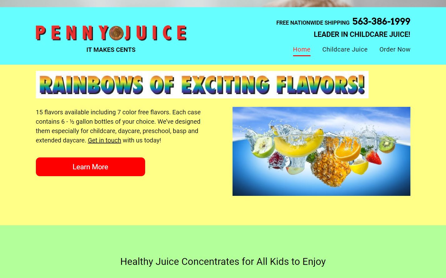
Another offender against colors is Penny Juice. Just because you’re selling colorful products doesn’t mean your site should adopt their vivid appearance.
If Pacific Northwest maintained the background color but changed up the texts, Penny Juice just went all out. You won’t be able to tell that the site is actually an online store thanks to the mixture of bright colors and a lack of negative space.
In addition, text readability suffers greatly, there is no clear navigation, and the poor children on its banner image are hidden behind lines of text and a solid background. It’s worth mentioning that the current bad design is actually an upgrade from how it looked back around 2015.
You don’t need a jumble of colors to make a statement: good web design can be simple and clean with a lot of white space.
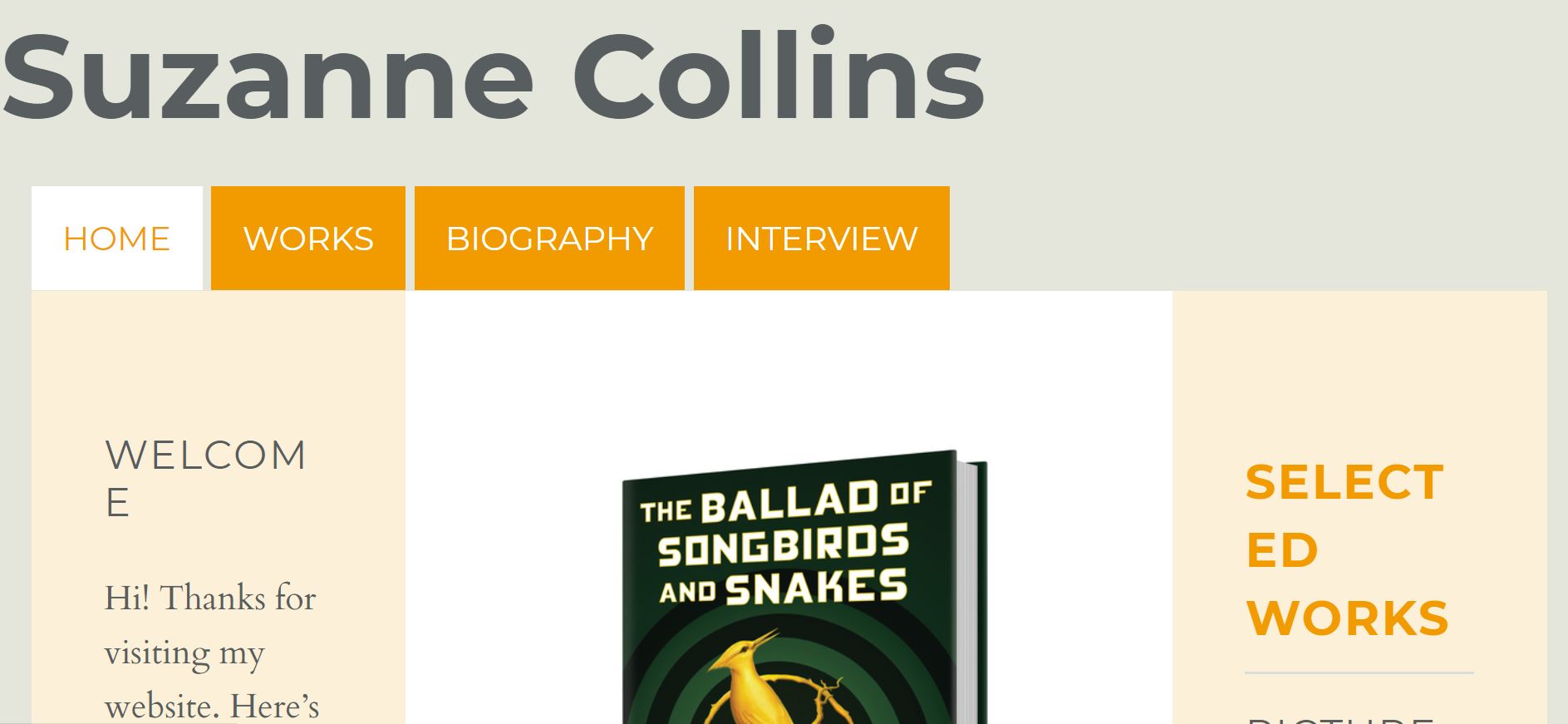
Considering that Suzanne Collins is the brains behind one of the most successful books and movie series ever, it’s quite a surprise to see that she runs a very humble site. So humble, in fact, that she didn’t bother to have it done professionally (and if she did, she didn’t get her money’s worth).
The first weird thing about it is that the site is designed for 200% zoom—that doesn’t mean you need to be so zoomed in to navigate it, it just looks quite better when viewed this way. The home page shows a photo of the author. Scroll down, and you’ll see a few of her famous works. Oddly, the pictures of the book covers aren’t aligned, with most on the left side and a few on the center.
The photo of the books come with a few reviews about it below… but you will only see the reviews for The Hunger Games: Mockingjay. If you want to read the rest, click on the Works link or highlight the entire home page—it seems the designer decided to use the same background color for the font. Suffice to say, Collins’s website is a combination of amateur but easily preventable mistakes.
Now, where do we even begin with this one?
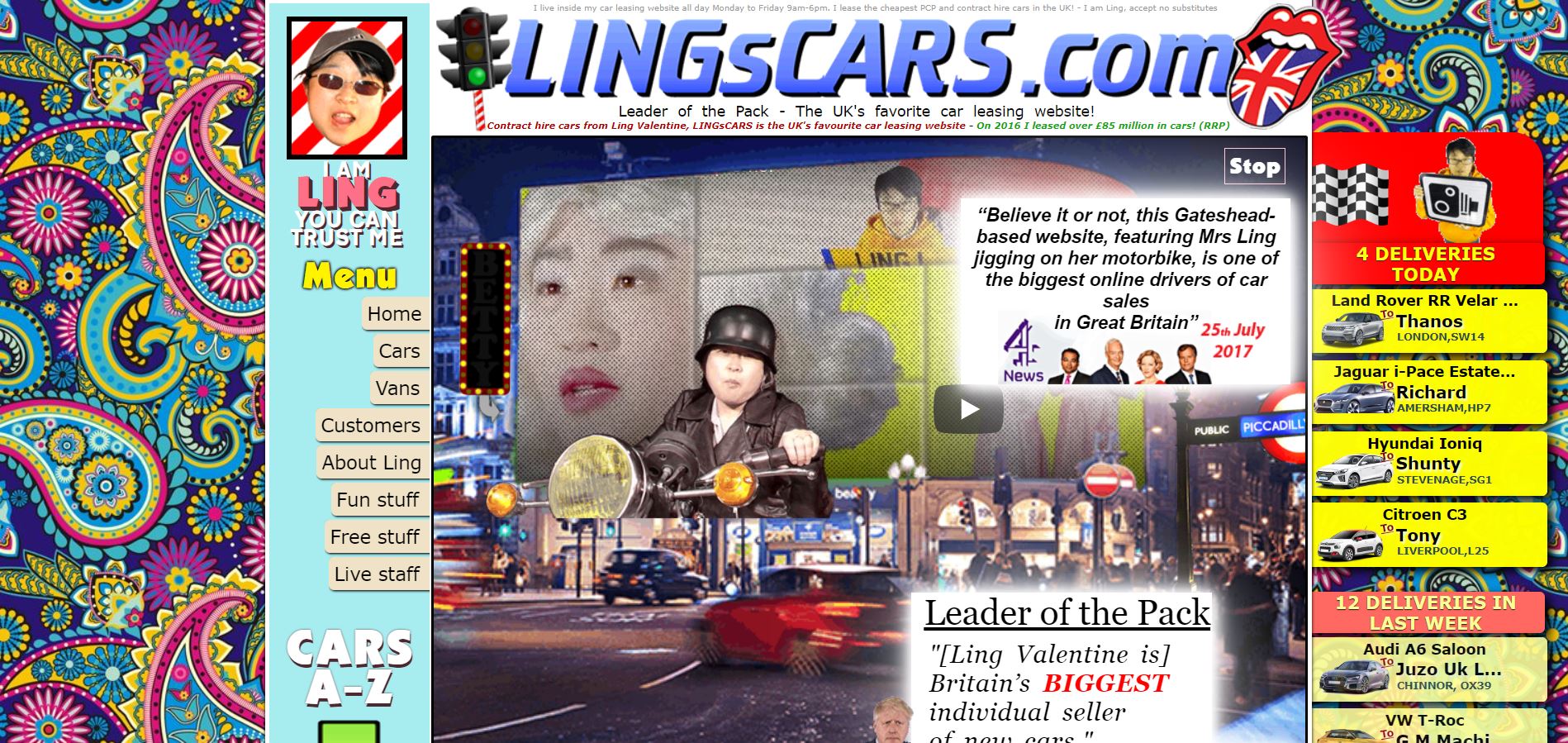
To be clear, Ling’s Cars does seem to be a big name in the car leasing industry in the Gateshead area of the UK. The site has good navigation, and the links work. But it’s certainly not perfect.
The tacky, psychedelic-looking background is unnecessary. The GIFs (featuring the owner, no less) and other images that move when hovered on, as well as the playful description of the best-selling cars, may be eye-catching, but they all make the site look unprofessional.
There’s a bunch of features that don’t really have anything to do with car leasing, like karaoke, games, and even a livestream of Ling’s Cars employees… what?
Now, we understand that these are gimmicks, and they possibly wanted to make the site cleaner at some point. However, it’s also likely that they were so far down the rabbit hole that they just went ahead with the joke. This doesn’t change the fact that it is problematic. Every element wants the visitors’ attention, so they don’t know where to look and probably gave up altogether.
In addition, a few crucial details about the business are at the bottom of the (very long) homepage, so the visitor has to keep scrolling down just to read them—definitely a no-no in UX.
Unity of the page elements’ style will make it look more smooth and concise, and is essential to the overall effortlessness in navigating the interface.
Your Customers Deserve Better
Today, websites are in place not only to present your business’s offerings. With the advent of e-commerce, they are now also essential in closing deals and converting visitors into customers. That’s why poor interface design and UX may be hurting your chances of a sale.
An understanding of the fundamental principles of UX like design, loading speed, clarity, ease of navigation, and others is the first step in coming up with the optimal website design and interface.
Have any other examples of websites with the worst UX design? Be sure to share them in the comments!

